CRITELLI'S SUMMER SALE | UP TO 70% OFF



8 Jewel Tone Color Palettes You Should Know

A jewel-tone palette usually enters the conversation at the same moment a room starts feeling flat. The sofa is good, the walls are safe, the rug is serviceable, yet the space still lacks depth. That's where saturated, gem-inspired colour comes in. Sapphire, emerald, garnet, plum, and peacock tones give a room presence without requiring every surface to be bold.
In design guidance, jewel tones are commonly described as rich blues, greens, purples, and reds associated with an elegant, luxury-forward look, and palette references often treat them as practical accent systems that pair well with metals and neutrals for premium interiors like upholstery, rugs, and statement seating, as outlined in this overview of jewel tone palette design language. They also work especially well when layered into a broader scheme of interior paint colour combinations, rather than chosen in isolation.
For Southern Ontario homes, this matters because jewel tones can add warmth, definition, and heirloom quality even when daylight shifts through the seasons. In compact rooms or low-light settings, they need better balance. Lighter neutrals, reflective finishes, and a properly chosen rug often make the difference between dramatic and heavy.
Table of Contents
- 1. Sapphire & Gold Classic
- 2. Emerald & Brass Contemporary
- 3. Amethyst & Plum Refined
- 4. Ruby Red & Charcoal Drama
- 5. Teal & Copper Balanced
- 6. Peacock Blue & Emerald Jewel Blend
- 7. Tanzanite & Gold Ultramodern Luxury
- 8. Indigo & Burnt Sienna Artisan Warmth
- 8-Pair Jewel Tone Palette Comparison
- Final Thoughts
1. Sapphire & Gold Classic
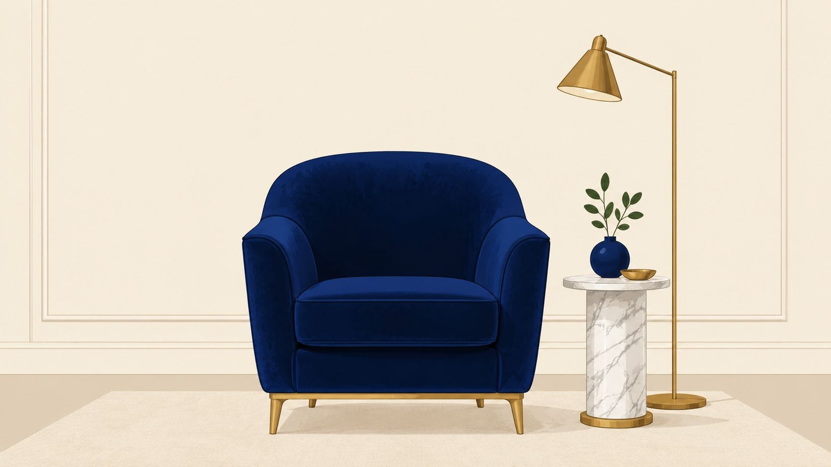
Sapphire and gold is one of the easiest jewel tone color palettes to recognise because it feels formal without becoming stiff. In a living room, sapphire velvet seating can carry the depth, while gold appears in lighting, frame details, or hardware. The result is polished and timeless craftsmanship rather than trend chasing.
This pairing often suits studies, formal sitting rooms, and primary bedrooms with traditional trim. In a Southern Ontario home, it can also bring needed richness to a room with pale walls and standard builder finishes. A sapphire chair, cream sofa, walnut table, and warm brass lamp already create a complete room concept.
Why it works
Gold keeps sapphire from feeling cold. Cream, ivory, and soft taupe stop the room from becoming too dark, especially in winter.
A hand-knotted rug is often the smartest starting point here. Critelli's Rug Market philosophy of “Art for your Floor” applies especially well to sapphire schemes because the rug can hold the strongest colour while the rest of the room stays balanced and bespoke.
Designer's Insight Pair a sapphire statement chair or sofa with an ivory or cream rug field, then repeat gold in only a few places. The room feels curated when the metal is deliberate, not scattered.
A practical example is a heritage-inspired sitting room with white mouldings, sapphire drapery, cherry or walnut wood, and a brass reading lamp. For homes leaning transitional, metal accents in interior design help explain why gold hardware and lighting can sharpen this palette without overwhelming it.
2. Emerald & Brass Contemporary
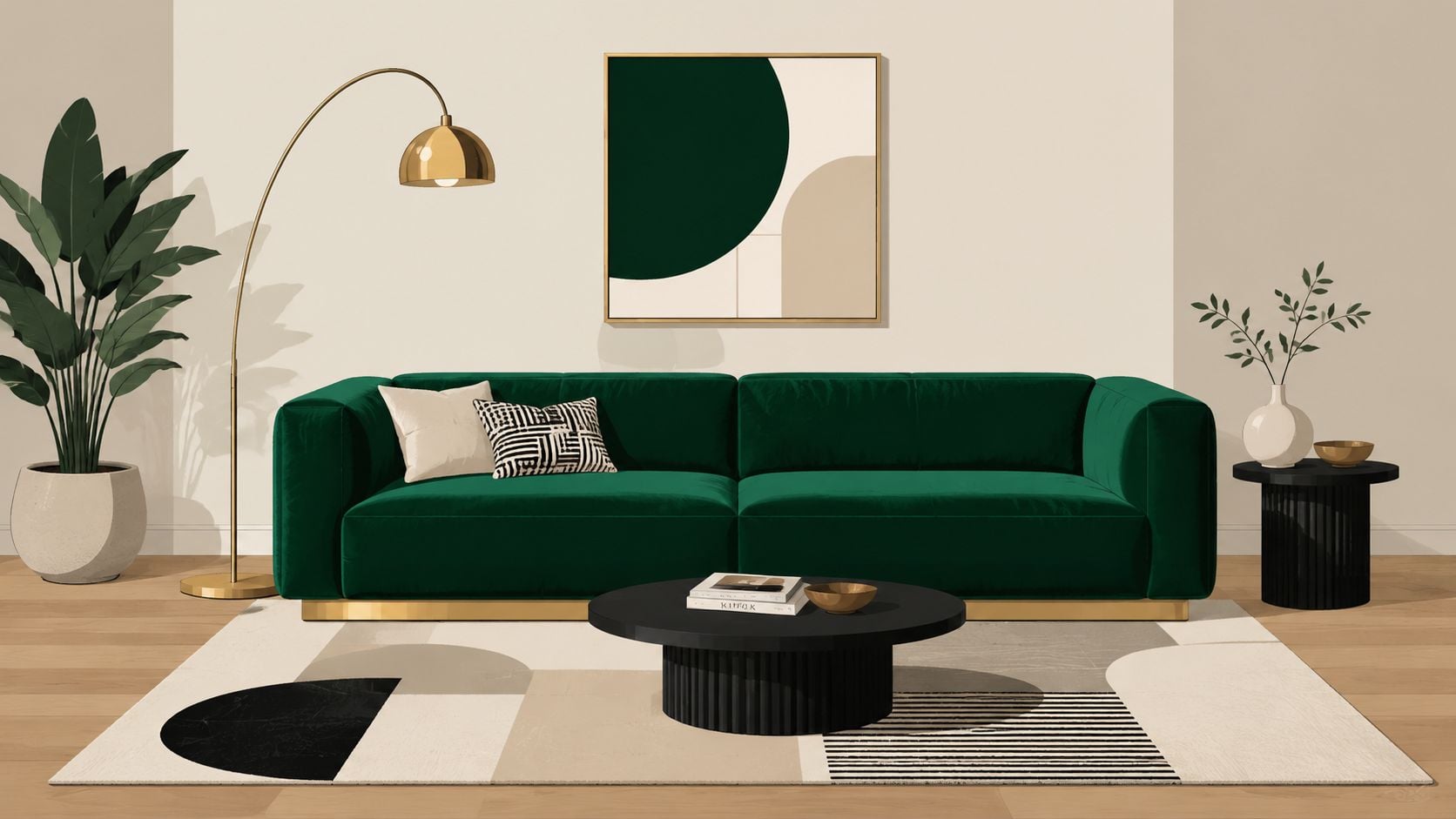
Emerald and brass feels fresher than many people expect. It's luxurious, but less ceremonial than sapphire and gold. In a Toronto condo, a Niagara townhouse, or a design-forward family room near Hamilton, emerald often reads as modern and grounded at the same time.
The best version of this palette starts with one strong move. That could be an emerald sofa, a pair of emerald accent chairs, or a well-fitted recliner in a saturated green fabric. Brass then supports the scheme through a floor lamp, side table hardware, or a mirror frame.
Best use in modern rooms
Warm neutrals matter here. Cream, warm grey, mushroom, and natural oak keep emerald from feeling theatrical.
- Use one anchor piece: A single emerald upholstery item gives the room identity.
- Let brass stay secondary: Lighting and small accessories are usually enough.
- Keep adjacent finishes quiet: Plain linen, boucle, or wool textures help the green stand out.
For decorative layering, a small object can reinforce the colour story without taking over. A piece like the Vitry green and gold vase shows how emerald and metallic accents can be repeated at a refined scale.
In contemporary rooms, emerald works best when the architecture stays calm and the materials do the talking.
3. Amethyst & Plum Refined
A purple room often goes wrong for one simple reason. The colour gets added as decoration after the main decisions are already made. Amethyst and plum work better when they shape the room from the start, the same way navy or forest green would.
That shift changes the result. In a bedroom, library, or quiet sitting room, these shades can create depth that feels calm rather than sugary. Plum has more brown and red in it, so it reads heavier and steadier. Amethyst carries a cooler cast, which makes it useful for contrast on a bench, pillow, or accent chair.
How to keep purple refined
The safest approach is to build the palette by value. Use one dark purple, one mid-tone purple, and a light neutral around them. That gives the eye a clear hierarchy. If every purple element is equally bold, the room can feel flat even though the colours are rich.
A practical layout helps. Try plum on drapery or a headboard wall, amethyst in a small upholstered piece, then cream, oatmeal, or soft taupe on larger surfaces such as bedding, carpeting, or trim. Brass works well here because it adds warmth without competing for attention. A fixture with coloured glass, such as this teal chandelier shade with bell form, can also introduce a controlled accent if the rest of the palette stays restrained.
Texture matters as much as hue. Velvet deepens purple, linen softens it, and matte paint keeps it from looking glossy or theatrical. This is one of the details many palette guides skip, but it affects the room immediately.
If the room includes wood panelling, ceiling beams, or a fireplace surround, darkened timber can ground the palette and keep it from drifting too decorative. These insights on timber cladding are useful for understanding how charred wood adds weight and contrast beside saturated colour.
For readers comparing undertones before ordering custom furnishings, this expert guide to the perfect colour palette is a useful companion.
4. Ruby Red & Charcoal Drama
Ruby red and charcoal is the boldest pairing on this list. It asks for restraint. When ruby appears in the right amount, the room feels well-composed and memorable. When it spreads everywhere, it can quickly turn heavy.
A formal dining room is a strong candidate. Ruby upholstery on dining chairs, charcoal cabinetry or trim, and an ivory wall can create depth without visual noise. This is also a natural palette for wine rooms, cocktail lounges, or moody entertaining spaces.
Where the contrast belongs
Ruby usually performs best as an accent rather than the background. A lamp, a set of chairs, a rug motif, or one upholstered piece is often enough.
- Choose one dramatic gesture: Ruby on seating or textiles reads more refined than ruby on every wall.
- Use charcoal as structure: Cabinetry, frames, and occasional tables carry the darker note well.
- Brighten the composition: Warm white ceilings, plaster, or stone surfaces prevent heaviness.
A red accent lamp can introduce this palette in a measured way, such as the Jocasta red table lamp. For exterior-minded homeowners who appreciate similarly charred and moody material stories, these insights on timber cladding offer a useful parallel in tone and texture, even though the application is different.
5. Teal & Copper Balanced
Teal and copper sits in the middle of the spectrum. It has the cool confidence of blue and green, but copper gives it warmth and approachability. In open-concept homes, that balance matters because one palette often has to move through several zones without feeling repetitive.
Teal is especially effective on larger upholstery pieces. A sofa, sectional, or recliner in teal can carry colour through living, dining, and kitchen sightlines, while copper appears in pendants, cabinet hardware, or a floor lamp near reading seating.
Making teal feel livable
One useful benchmark for specifying jewel-like intensity comes from a design reference that describes jewel tones as typically sitting around 83–73 saturation and 76–56 brightness. For interiors, that's a helpful reminder that teal should feel rich, not neon, and copper should warm it rather than compete with it.
Teal also works well with mixed woods. White oak keeps the palette airy. Walnut gives it more depth. A ceiling fixture such as the Bell light teal chandelier shade can echo the main colour in a subtle, design-forward way.
Practical rule If teal is used on a large piece of upholstery, keep at least one major surface light. That could be the rug, the wall colour, or the drapery.
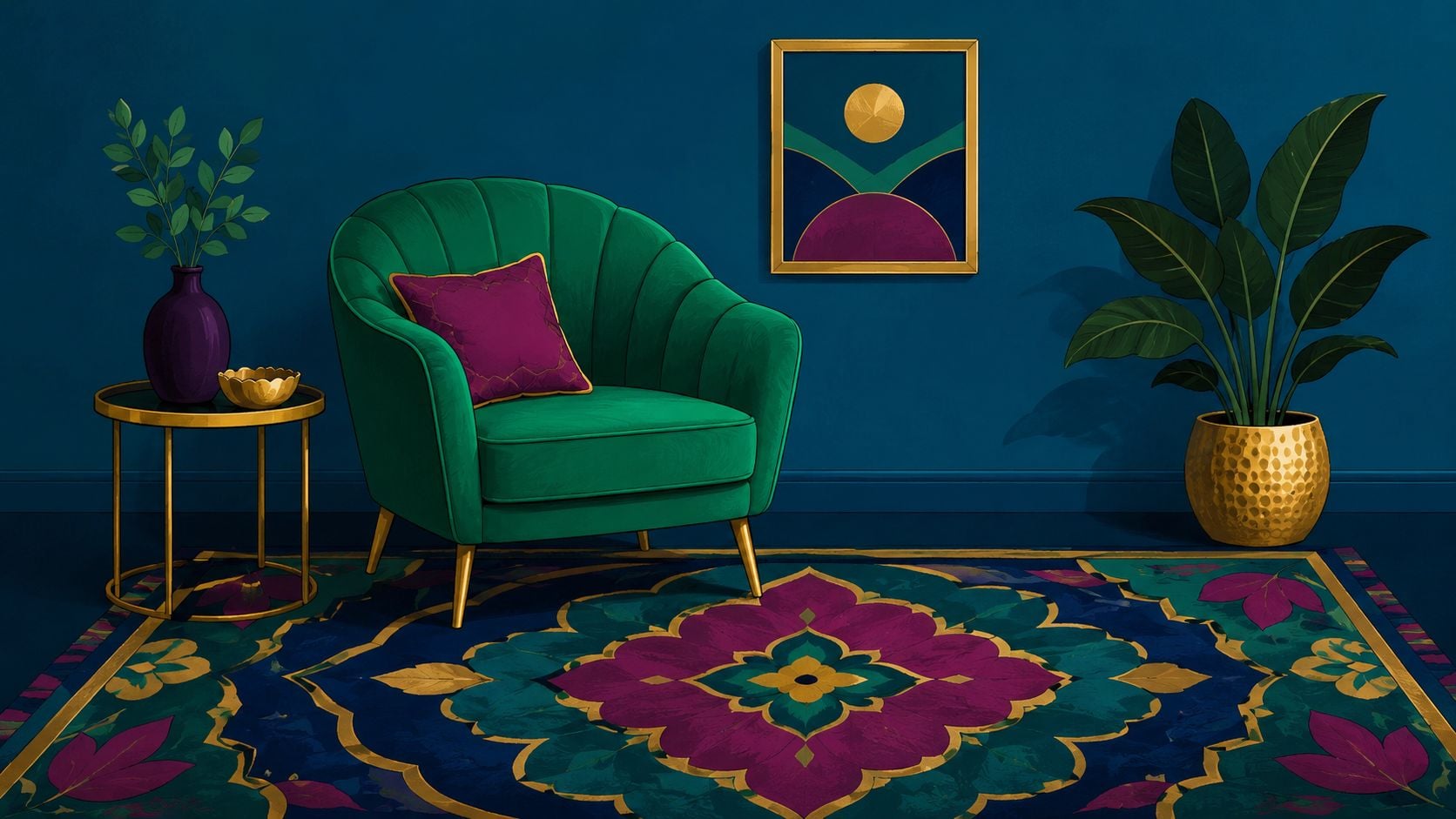
6. Peacock Blue & Emerald Jewel Blend
A room with peacock blue and emerald can feel like a well-styled gallery lounge or like a small box of saturated color. The difference usually comes down to distribution. Two jewel tones in equal amounts compete for attention, so this pairing works best when one color carries the room and the other appears in smaller, deliberate moments.
Peacock blue usually handles that lead role better because it has more range. It can read almost neutral on a sofa, rug, or painted bookcase, especially when the room includes wood, cream, or stone. Emerald is sharper and brighter to the eye, which makes it useful as an accent on a chair, a band of trim on drapery, a bench cushion, or a single ceramic lamp.
Layering two strong jewel tones
Assign the colors jobs before you shop. That simple step prevents the common mistake of buying several beautiful pieces that fight each other once they are in the same room.
A helpful starting ratio is about 70 percent peacock blue, 20 percent grounding materials, and 10 percent emerald. Grounding materials might be warm walnut, blackened metal, parchment shades, or a light rug background. They work like spacing in typography. Without that visual pause, the rich colors blur together and lose their shape.
This palette tends to suit libraries, music rooms, dining rooms, and conversation areas because those spaces can carry more mood. In a compact room, keep the largest surface lighter than you first planned. That could be the wall color, the rug field, or the drapery base cloth. One pale plane gives the eye somewhere to rest.
The safest order is rug first, then upholstery, then accents. For example, a peacock-patterned rug with cream in the field can anchor the room, a deep blue-green sofa can repeat the dominant tone, and emerald can appear in only two or three places, such as pillows, art matting, or the inside back of a bookcase. That approach feels collected instead of crowded.
Designers often get this combination right by treating it as a full composition rather than a set of isolated purchases. If the upholstery, drapery, lighting, and wood finish are chosen together, peacock blue and emerald read as layered and intentional instead of heavy.
7. Tanzanite & Gold Ultramodern Luxury
A common modern-room problem looks like this. The furniture lines are clean, the finishes are expensive, and the room still feels flat. Tanzanite helps because it carries the structure of blue with a violet cast that feels sharper and less expected than navy. Paired with gold, it creates contrast that reads polished rather than decorative.
This combination suits spaces with restraint already built in, such as a sleek bedroom, a condo living room, or a dining area with simple architecture. Tanzanite should do the visual heavy lifting on one major piece, such as a velvet bed, a lounge chair, or a structured sofa. Gold then works like jewelry on a plain black dress. A little is enough to define the look.
A cleaner way to use it
The easiest mistake with this palette is scattering both colours in small doses around the room. That makes the space feel restless. A stronger method is to keep tanzanite concentrated, then repeat gold in two or three precise places.
- Start with one anchor piece: A tanzanite headboard, sofa, or pair of dining chairs gives the room a clear center.
- Choose a light architectural backdrop: White paint, pale oak, limestone, concrete, or light grey upholstery keeps the palette crisp.
- Limit gold to hard surfaces: Sconces, cabinet pulls, a table base, or a slim mirror frame usually gives enough contrast.
- Watch the undertones: Bright yellow gold can feel flashy against cool tanzanite. A softer brushed gold often looks calmer and more current.
Texture matters more here than pattern. If the room already has strong geometry in the architecture, keep fabrics quiet and let sheen do the work. Matte walls, a low-lustre rug, velvet upholstery, and brushed metal create depth without adding clutter.
One practical test helps. Squint at the room from the doorway. If you can identify one tanzanite focal point and only a few gold highlights, the palette is probably balanced. If gold appears in every corner, the room will start to feel staged instead of refined.
For digital presentations, swatches, and online product galleries, check contrast carefully so the difference between the blue-violet base and metallic accents remains easy to read on screen.
8. Indigo & Burnt Sienna Artisan Warmth
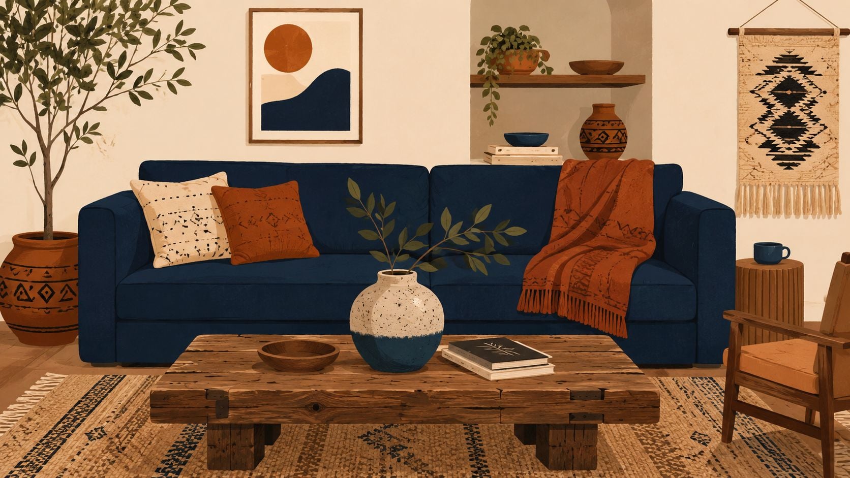
A room with indigo and burnt sienna often feels settled from day one. The blue brings depth, while the sienna adds the kind of warmth you get from clay, saddle leather, and sunbaked earth. Together, they create a jewel-tone palette that feels crafted rather than formal.
This pairing works well in homes that already have honest materials. Oak floors, wool throws, matte pottery, woven shades, and aged metal all give these colors something to connect to. Indigo usually works best as the larger visual weight, such as a sofa, painted bookcase, or upholstered bed. Burnt sienna then shows up in smaller, touchable pieces like a lumbar pillow, ceramic lamp base, leather bench, or vintage-style rug border.
Why this pairing feels collected
The key is texture. Indigo can look flat if it appears only on smooth painted surfaces, and burnt sienna can feel dusty if it is used without contrast. Bring in materials with visible grain and weave. Linen curtains, nubby wool, hand-thrown ceramics, terracotta planters, and rubbed wood finishes give the palette the layered look people often want but rarely know how to build.
A simple way to judge the balance is to separate the colors by role. Let indigo carry the visual depth. Let burnt sienna carry the warmth. That division keeps the room readable, much like a good outfit with one dominant fabric and one accent material.
This palette also suits spaces that need warmth without heaviness. In a bedroom, indigo bedding against a warm white wall can feel cocooning, while sienna comes in through a throw, bedside pottery, and a rust-toned rug pattern. In a living room, an indigo chair or sofa can anchor the seating area, and burnt sienna can repeat through leather binding on books, a ceramic vase, or a single accent cushion.
For a family-run showroom with a heritage mindset, this kind of palette aligns naturally with artisanal materials, bespoke upholstery, and heirloom quality rugs that become lasting room foundations.
8-Pair Jewel Tone Palette Comparison
Choosing between jewel tone palettes can feel a bit like comparing fabrics in a showroom. Two options may look equally rich at first glance, but they behave very differently once light, scale, and materials enter the room. This table is meant to make those differences easier to read, especially if several palettes appeal to you for different reasons.
| Palette | Implementation complexity | Resource requirements | Expected outcomes | Ideal use cases | Key advantages | Key considerations |
|---|---|---|---|---|---|---|
| Sapphire & Gold Classic | Moderate. Needs balanced lighting and well-chosen finishes | High. Deep blue fabrics, gold metallics, cream neutrals, layered lighting | Timeless luxury and formal elegance | Formal living rooms, libraries, primary bedrooms, dining rooms | Refined backdrop. Works well with leather, marble, and brass | Can feel formal or heavy. May overwhelm small or poorly lit spaces |
| Emerald & Brass Contemporary | Moderate. Contemporary styling needs careful color coordination | Medium to high. Emerald velvet or upholstery, brass fixtures, quality textiles | Fresh, modern luxury that still feels welcoming | Modern living rooms, contemporary bedrooms, upscale offices | Versatile. Pairs well with wood and stone. Feels polished without feeling stiff | Needs balanced lighting. May compete with busy patterns. Can feel trend-driven if materials look cheap |
| Amethyst & Plum Sophisticated | Moderate. Tonal layering and lighting control matter | Medium. Varied purple textiles, warm neutrals, brass accents | Cohesive, gallery-like interior with creative depth | Primary bedrooms, home offices, art studios, collector homes | Monochromatic richness. Strong setting for art and textiles | Purple can be polarizing. Needs careful lighting and good materials |
| Ruby Red & Charcoal Drama | High. Strong contrast calls for precise styling and lighting | High. Rich red upholstery, charcoal finishes, edited decor | Bold, dramatic, memorable interiors | Formal dining rooms, executive studies, luxury entertainment spaces | Strong visual impact. Works well with leather and polished metals | Risk of a cave-like effect. Can feel overpowering in casual homes |
| Teal & Copper Balanced | Low to moderate. Success depends on warm and cool undertones staying in balance | Medium. Teal upholstery, copper accents, mixed neutrals, natural wood | Refined comfort with natural harmony | Open-concept living areas, primary bedrooms, contemporary homes, spa-like rooms | Adaptable. Calming but still visually active. Pairs with many materials | One undertone can take over if you are not careful. Copper finish selection matters |
| Peacock Blue & Emerald Jewel Blend | High. Multi-tone balance and premium finishes are required | High. Saturated paints and fabrics, complementary metallics, ample lighting | Rich, layered, gallery-like luxury and depth | High-ceilinged spaces, collector homes, boutique-style interiors | Deeply polished and collected. Excellent backdrop for art | Can overwhelm the eye. Needs strong light and high-quality materials |
| Tanzanite & Gold Ultramodern Luxury | High. Works best with cohesive modern furnishings | High. Distinct tanzanite tones, gold finishes, sleek modern materials | Fashion-forward luxury with a rare, directional feel | Modern penthouses, contemporary showrooms, design-forward homes | Distinctive and elegant. Violet undertones add dimension | Very contemporary. May date faster than more classic pairings. Needs confident styling |
| Indigo & Burnt Sienna Artisan Warmth | Moderate. Requires balance between artisanal texture and jewel-tone depth | Medium. Indigo textiles, sienna accents, natural materials, handcrafted pieces | Textured interiors that feel warm, grounded, and rich | Eclectic homes, artisan-focused spaces, rooms built around handcrafted rugs | Combines jewel-tone depth with organic warmth. Suits handcrafted decor | Can skew too rustic or too formal. Materials and lighting still need care |
A quick way to use the chart is to focus on two columns first: implementation complexity and key considerations. That tells you whether a palette is attractive in theory or actually workable in your room.
If your space has average ceiling height, mixed natural light, and everyday family use, teal and copper or indigo and burnt sienna are often easier to handle than ruby and charcoal or peacock blue and emerald. If the room is formal, spacious, and already supported by strong finishes, the bolder pairs have more room to succeed.
Final Thoughts
A room with jewel tones usually goes wrong in a familiar way. The color choice is strong, but everything around it is undecided. A sapphire chair sits against the wrong white, or an emerald sofa competes with busy wood tones, and the space feels disjointed instead of intentional.
Jewel tone color palettes work best when they guide the room early. They set the temperature, the contrast level, and the finish choices around them. Once that anchor is clear, neutrals, metals, wood tones, and textiles have a job to do.
In practical terms, start with the hardest-working surface. Often that is the rug. A rug can establish the palette, connect upholstery to case goods, and show whether your jewel tone reads rich, moody, warm, or cool under real lighting conditions. That is especially useful if upholstery is still being selected or custom pieces will take longer to finalize.
For Southern Ontario homes, light quality changes the result more than many homeowners expect. North-facing rooms and long winters can flatten saturated colors, so lighter walls, reflective finishes, and layered lamps often help the palette stay vivid. Smaller rooms also benefit from a clear hierarchy. One dominant jewel tone usually works better than several colors competing at equal strength.
Precision matters here. Good jewel tone rooms are built the way a well-balanced outfit is built. One statement piece leads, supporting colors repeat in smaller doses, and the finish palette keeps everything coherent. If the blue in a rug has a green cast, the nearby velvet, paint, and metal accents need to respect that undertone rather than fight it.
That is why successful rooms rarely happen by accident.
Critelli Furniture's history as a family-run business founded in 1914 fits naturally with this kind of step-by-step planning. A finished room often depends on more than one purchase. Upholstery, rugs, lighting, wood finishes, and final placement all affect whether jewel tones feel refined or overly heavy. For clients across Greater Niagara, Hamilton, and Toronto, that kind of coordinated selection can make bold color easier to use with confidence.
The clearest takeaway is simple. Jewel tones do not need to cover the whole room to shape it. One saturated piece, one grounding rug, and one warm or contrasting metal finish are often enough to create depth, clarity, and a room that still feels comfortable to live in.