


How to Build an Interior Design Mood Board That Works


You saved forty photos of rooms you like, and none of them agree with each other. The sofa is grey in one, blue in the next, and the rug never matches the oak floor you already have. An interior design mood board earns its place only when it settles those disagreements before anyone orders a custom piece.
A useful board is a decision document. It tests light, durability, room fit, and how the room will work years from now. Pretty collages do not do that work.
The Parts Every Mood Board Needs
A homeowner arrives at a consultation with a phone full of rooms and no decision. The first job is to sort what is already there into five layers. If a layer is empty, that is the gap to fill before anything else is gathered.
| Layer | What It Shows | Typical Items | Aim For |
|---|---|---|---|
| Anchor piece | The main furniture or rug that sets scale and budget | Sofa, leather chair, hand-knotted rug | 1 to 2 pieces |
| Palette | Core colours and their undertones | Paint chips, fabric swatches | 3 to 5 colours |
| Texture and material | Finishes that give the room depth | Wood, metal, linen, wool samples | 4 to 6 samples |
| Lighting | Colour temperature and fixture types | Lamp photos with CCT and CRI notes | 1 note per lighting layer |
| Mood and reference | Overall feel and how pieces sit together | Styled-room photographs | 6 to 12 images |
Anchor piece. One sofa, one leather chair, or one rug leads the board. Its size and price set every later choice.
Palette. Three to five colours, each labelled warm or cool. A warm grey and a cool grey change the whole room.
Texture and material. Four to six real samples of wood, metal, linen, and wool. Photographs of texture are not samples. A closer look at texture in interior design shows why the hand test matters before a finish is locked in.
Lighting. A note of colour temperature and fixture type beside each lamp image.
Mood and reference. Six to twelve styled-room photographs that share the same light, not a scrapbook of every style you have ever liked.
Critelli's designers treat every piece as part of a complete room concept, not a standalone purchase. The same discipline shows up when a kitchen is planned as a whole: a kitchen redesign from concept to construction only holds together when materials, light, and layout are decided together.
Count which layers your saved photos already cover. List the missing ones, and gather only those.
How to Build Your Mood Board Step by Step
Say the room is a Thorold living room with a warm oak floor and a brief for a grey-blue sofa. The board has to prove that sofa belongs with that floor, not just that it looks handsome on a screen.
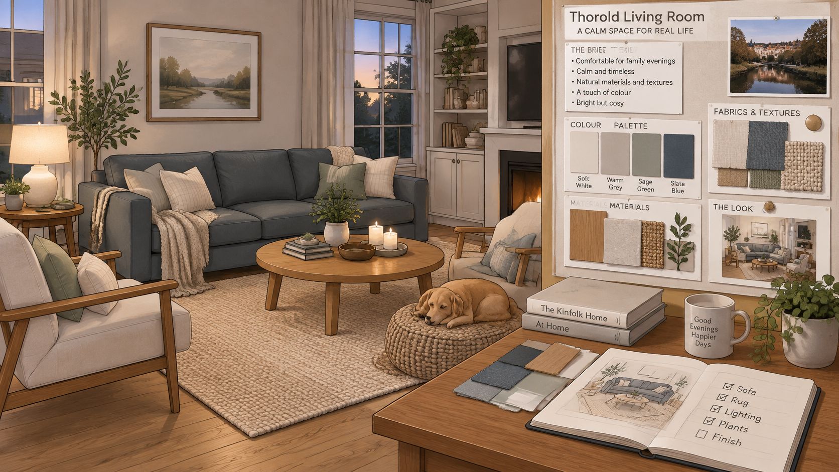
Write a one-sentence brief. Name who uses the room, when, and the mood. "A calm room for evening reading" is enough. Without that sentence, every later cut is a taste argument.
Collect, then cut hard. Gather thirty to forty images from saved photos, showroom visits, and material samples. Keep twelve that share the same light and mood. The rest are distractions, however lovely.
Name the anchor first. The grey-blue sofa's length and leg finish decide the rug, the chair scale, and the wood tone. Starting with accessories reverses the budget.
Extract the palette. Pull three to five colours and mark each as warm or cool. The oak floor is already a warm neutral, so a cool grey-blue needs a warm secondary or the room will look split.
Add one texture per material. One oak sample, one metal, one linen, one wool. If a material is in the room and not on the board, it will surprise you at delivery.
Lay the board in a 60-30-10 split. About sixty percent dominant neutral, thirty percent secondary, ten percent accent. The oak and a soft wall colour carry the sixty. The sofa carries the thirty. A cushion or lamp shade carries the ten.
Annotate every item. One short reason and one dimension. "Grey-blue sofa, 84 inches, cool enough to quiet the oak" is a decision. A picture with no note is still a wish.
Choose a format you will reopen
A corkboard or a printed sheet suits a showroom visit. A shared digital board suits a remote review with a partner who cannot attend. Print swatches at actual size either way. Screens shift colour, and a digital board cannot show how a finish feels under your hand.
You are ready when you can explain each item in one sentence, and removing any one of them would weaken the room. If you are unsure where a room should begin, the interior design process for a room starts with the same brief-before-samples order.
Testing Swatches and Finishes Before You Commit
A board is only as reliable as the light it was seen in. Set the lighting targets before you judge a single swatch.
| Lighting Layer | Purpose | Target Values | Board Note |
|---|---|---|---|
| Ambient | Overall room light | 2700-3000K, CRI 80 or higher | Show ceiling or cove fixtures |
| Task | Reading, cooking, desk work | 2700-3000K, CRI 90 or higher | Mark where light falls on the work surface |
| Accent | Art, shelves, rug highlights | 2700-3000K, CRI 90 or higher | Show beam angle in the photo |
| Decorative | Pendants, table lamps, sconces | 2700-3000K, CRI 80 or higher | Show the fixture in a styled room photo |
Natural Resources Canada.pdf) defines colour-rendering index (CRI) as a 0 to 100 measure of how accurately a lamp renders colours, and correlated colour temperature (CCT) as the warm-to-cool appearance of light. Its residential guidance recommends 2700–3000K lamps for a warm, inviting atmosphere, and names four layers: ambient, task, accent, and decorative.
A short test routine
Place fabric, leather, wood, and rug samples under the exact lamps you plan to install. Compare each sample in daylight and again in evening light, and write down any shift. Check the CCT of each lamp against that 2700–3000K range.
Showroom photography taken under unknown lighting is a common trap. A neutral fabric can look yellow, grey, or blue once it is installed. Dark finishes absorb light and pale finishes reflect it, so a swatch that looks right on a bright wall can read dull in a north-facing room. Final colours have to be checked in the client's home, which is why Critelli's In-Home Service reviews textures, colours and configurations in the customer's actual environment before anything is ordered. Ordering from a screen adds another risk, and it helps to know how to avoid colour mismatch when ordering online before you place anything in a cart.
The same caution applies to metal. A brushed brass that looks warm beside oak can turn brassy under a cool lamp, and the risk doubles when several finishes share one sightline. The classic case is mixing metal finishes in your bathroom, where brass, black and chrome often sit within arm's reach of each other. Test each metal under the lamp you will install, at the time of day the room is used most, and write the result beside the sample.
Durability beside the swatch
On every sample, note expected lifespan, care, whether it can be reupholstered or repaired, local availability, and the VOC content of paint and finishes. If a paint or finish carries no listed VOC figure, ask the supplier for the data sheet before you approve it, and record whether a low-VOC version of the same product exists.
Practical rule: Keep a well-made frame and replace the most disposable item first. Retaining a sound sofa and changing the cushion fill often cuts replacement demand more than buying the newest eco-labelled piece.
Write the test result beside each swatch. Mark anything that still needs a home test before approval.
Turning the Board Into a Room Plan
Measure each wall, window, and doorway. Draw the room to scale on a grid, using 1/4 inch to 1 foot as a practical start. That drawing is the test every board item has to pass, because a finish that cannot fit through the doorway or sit inside the clearance never becomes a decision.
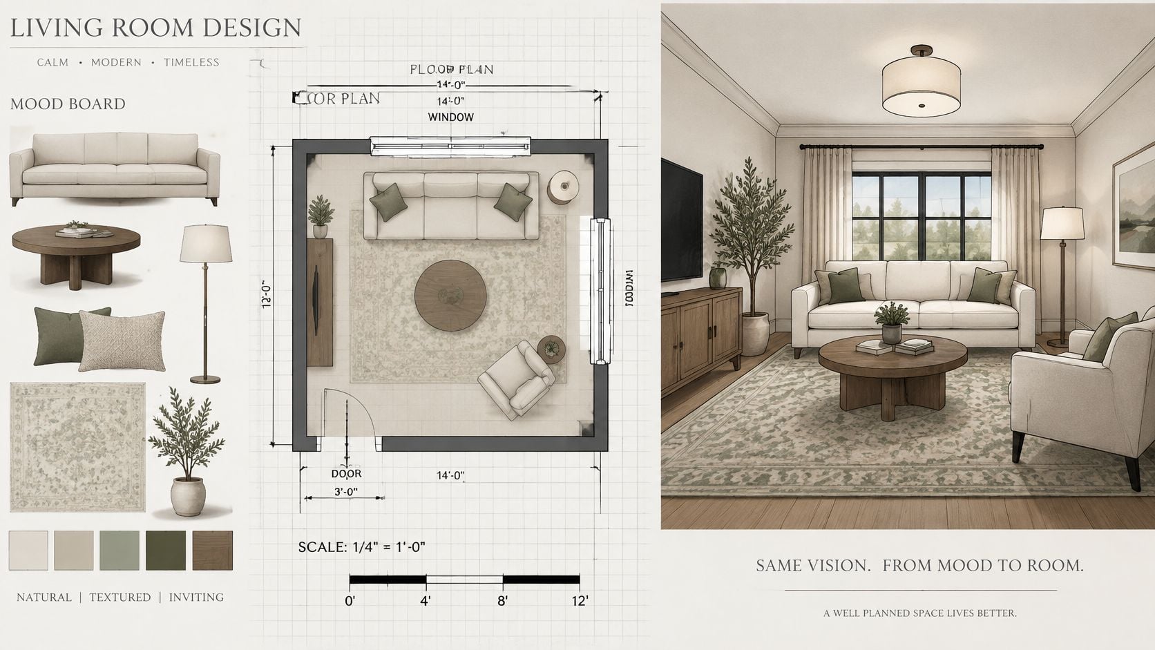
Place the anchor rug first. It defines the seating group and the palette that sits on it. Hand-knotted rugs are the foundation of most room plans, so the size and weave get settled before the furniture around them.
| Room or Seating Setup | Rug Size | Placement Rule |
|---|---|---|
| Living room, three-seat sofa and two chairs | 8 x 10 ft | Front legs of all seating sit on the rug |
| Living room, sectional sofa | 9 x 12 ft | Front legs of the sectional and one chair sit on the rug |
| Dining room, six chairs | 8 x 10 ft | Chairs stay on the rug when pulled out |
| Bedroom, queen bed | 8 x 10 ft | Rug extends 18 to 24 inches beyond each side and the foot |
| Entry or hall | 2.5 x 8 ft runner | Runs the length of the traffic path |
Set seating so the front legs of every main piece sit on the rug, and mark circulation paths at least 36 inches wide. Then map the four lighting layers onto the plan: ceiling or cove for ambient, a reading lamp for task, a picture light for accent, and a pendant or table lamp for decorative. Each layer answers a question the swatches cannot, since a fabric sample says nothing about where the light will land.
A bold leather chair with a neutral wool rug is a pairing that balances a room's energy: the leather carries the accent, and the wool keeps the room quiet.
Compare lifestyle photographs of the fully styled room against the plan. Isolated product shots hide how pieces read together at real distance and real scale.
What the visit adds
Critelli's In-Home Service sends consultants to the home for a spatial analysis of natural light, room scale, and how the family uses the rooms. From that visit they build a must-be-right plan, a roadmap of how textures, colours, and configurations will look in that environment. A shared digital plan still needs that site check. Careful interior design space planning is what turns the rug size and the 36-inch paths into a room you can walk.
For a second view of how furniture reads once it is placed, room staging guidance for interior designers offers a useful cross-check on scale and negative space.
Every board item should carry a position, a size, and a light source on the plan. If one of those three is missing, hold the order.
Planning the Board for Aging and Daily Life
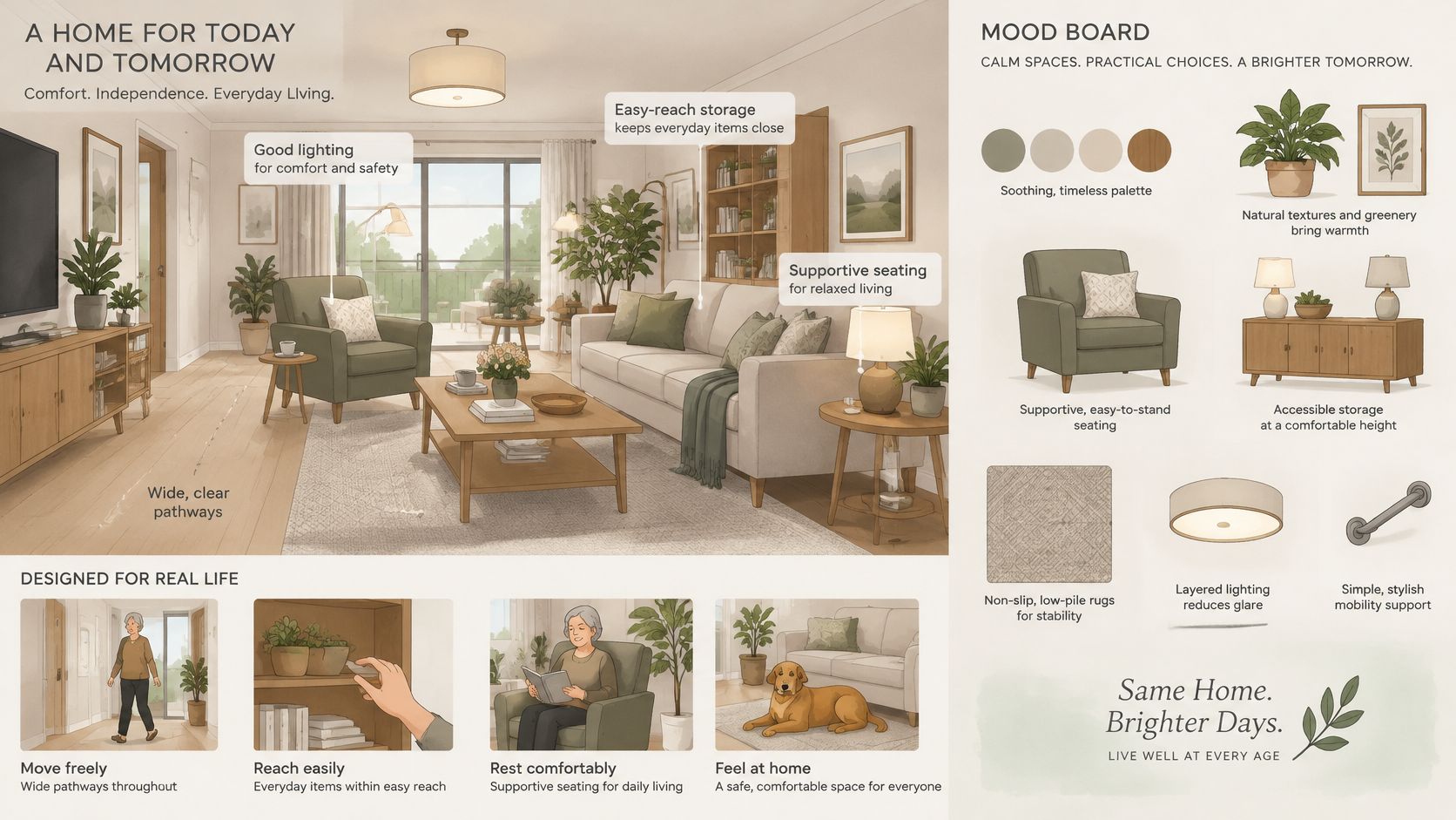
Boards built for a showroom visit rarely include a clearance diagram. That gap shows up the day someone needs a clearer path, a firmer seat, or less glare. Accessibility belongs in the brief on day one, especially for custom furniture Southern Ontario clients who want a refined room that stays easy to live in for decades.
Canada's population aged 65 and older represented about 19% of the population in 2022 and is projected to reach 25% by 2059, according to the Canada Mortgage and Housing Corporation. The same source, drawing on Statistics Canada, notes that home adaptations were used by 51.9% of Canadians aged 80 and older. A Southern Ontario household planning to stay put is the mainstream case.
An accessibility layer on the board
Treat each of these as a pass or fail test, with a small plan thumbnail of the clearance beside it:
- Clear paths: circulation drawn on the plan, including an unobstructed route from seating to a doorway.
- Seat height: 17 to 20 inches, with arms, noted beside each chair image.
- Hardware: lever handles instead of knobs, shown as a detail swatch.
- Glare control: dimmers on the lamps and a shade on every window the afternoon sun hits.
- Floors: slip-resistant finishes, such as matte tile or a low-pile rug with firm backing, placed next to the rug swatch.
- Adaptable layout: a plan option that lets a bedroom move to the ground floor without a new furniture order.
A rounded-arm sofa and a brass lever read as refined pieces that happen to be easy to use. The worry that accessible design looks clinical usually comes from leaving these choices until a renovation, when the only options left are grab bars and plastic.
Could someone with a walker, or with reduced vision, use this room without moving a single piece of furniture?
If the answer is no, the board is not finished. Choosing furniture that grows with your family applies the same test to seating that has to last more than one life stage. A durability claim only matters if the room can still be used when the household changes.
Confirm the Board Before You Order
Hold the board up against the one-sentence brief. If the brief was a calm evening room and the board has drifted into a bright entertainment layout, something was added without a reason. Confirm each item's dimensions and its light source. Flag anything that still needs a home test, and leave those pieces off the order until they pass one. The board is a decision document: every item on it should have survived a light check, a durability question and a fit test before it earns a place on the order.
Clients in St. Catharines often reach this point with a strong palette and one open question, usually scale or leather colour. That is the moment for a consultation, where a trained eye settles in one visit what another week of saved photos will not. Critelli's design services cover space planning, custom orders, style guides and design advice, and you can book a free consultation by calling 1-877-322-1172. The design team works from your brief, including finish decisions such as paint shades and the room layout. Through the In-Home Service, a consultant studies the natural light, room scale and daily demands of the household, then builds a "must-be-right" plan showing how textures, colours and configurations will look in your actual rooms. A board confirmed against real light and real dimensions is a board you can order from.
See it, then place it
Experience the craftsmanship in person at the King Street Showroom. The first visit includes a design team member who spends time with you until you are satisfied with the selection. Before the home is complete, Critelli's invites you to a final presentation where every leather, fabric and configuration is tuned to your style. Collections from Stickley, Stressless, Hancock & Moore and Century sit in that same review, so a curated selection gets judged in the room under real light.
White-glove delivery is the board's final test. For homes across the Greater Niagara, Hamilton and Toronto markets, the team handles inspection, assembly, precise placement and removal of all packaging. The room should look showroom-ready when they leave. For buyers furnishing homes across Niagara, a measured plan proves itself here: pieces sized on the board survive the move into the house.
The Greater Niagara Chamber of Commerce reports that the family-run company reached 110 years in business in 2024. A retailer that has furnished Southern Ontario homes since 1914 has watched which finishes wear well and which date quickly. That continuity is why a board aimed at heirloom quality fits this showroom better than a seasonal trend.
Visit the Rug Market to find your room's foundation. If the rug on the board still has no size, no placement rule and no home-light test, keep it off the order, however artisanal it looks.
Critelli Furniture helps Southern Ontario homeowners turn an interior design mood board into a complete room, from the first swatch through space planning, custom orders and white-glove placement. The King Street Showroom and the Rug Market let you test scale, texture and light before you commit. Visit Critelli Furniture to book your complimentary design consultation and see the pieces in person.