CRITELLI'S SUMMER SALE | UP TO 70% OFF



Interior Design Space Planning That Actually Works

The room is already telling on itself. The sofa is too long for the wall, the rug stops short under the coffee table, and the dining chairs feel stranded because no one measured the walking path before anything was ordered. That is exactly where interior design space planning earns its keep, because a refined room is built from circulation, proportion, and use first, then dressed with colour, texture, and finish.
For homeowners in Southern Ontario, that order matters even more in premium homes where every piece has to live well, not just look beautiful. Interior design space planning is the early-stage work of analysing how a room will function, then mapping zones, traffic paths, and furniture placement so the layout supports daily life. In a market where North America accounted for 34% of the global interior design market in 2024, and the global market was valued at about USD 150 billion that year, the pressure to get the plan right is commercial as well as aesthetic, especially when residential work represented 57.39% of the services market in 2025 and about 60% of total market revenue in 2024 interior design market data.
Why Space Planning Comes Before Styling
The mistake most homeowners make is reaching for fabric swatches before they've decided how the room is supposed to behave. A room can be handsome and still fail if a chair blocks a door swing, a sectional eats the circulation path, or the rug floats like an island in the middle of the floor.
The layout is the part you live with every day
Space planning starts with use, then moves to zones, then to furniture. That sequence is what keeps a room efficient, because it treats walking paths, seating clusters, and focal points as working parts of the composition rather than afterthoughts. In practical terms, the room has to answer basic questions first. Where do people enter, where do they pause, where do they sit, and what has to stay clear?
That order also protects the budget. A repaint is relatively easy to change, but a failed layout can force a second round of furniture purchases, alterations, or custom work. For anyone comparing refresh costs, a useful neutral reference point is the cost to repaint a 3-bedroom home, because it shows how quickly a small visual change can sit beside a much larger layout decision.
Practical rule: If the room only works when everything is pushed against the perimeter, the plan probably isn't finished yet.
For families shopping in Luxury furniture Niagara or booking Interior design services St. Catharines, that shift in order changes the whole experience. The goal is not to decorate a room and hope the layout works. The goal is to decide how the room should function, then choose pieces that support that function with timeless craftsmanship, not visual guesswork.
Measure, Draw, and Pressure-Test Your Floor Plan
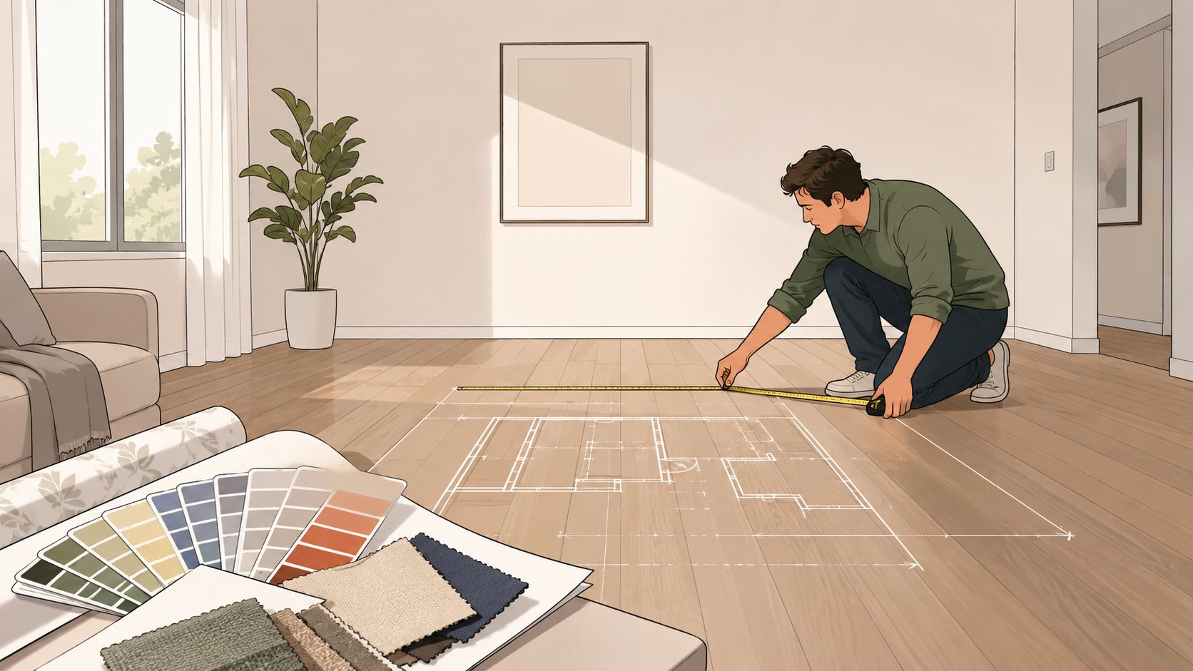
A proper plan begins with numbers, not instincts. Every wall, doorway, window, column, vent, radiator, and built-in has to be measured and placed on a scaled drawing, because a room that looks generous from memory can shrink fast once the fixed elements are mapped.
Build the base plan before any furniture is chosen
Use a tape measure, then redraw the room to scale on graph paper or in a floor-plan tool. Mark every obstruction, because a radiator or outlet that gets forgotten on paper usually becomes the reason a sofa has to be returned. The value of this step is simple. It turns “I think it fits” into a testable layout.
Professional space-planning practice also uses a feasibility check before pieces are specified. In nonresidential interiors, the summed programmed spaces are commonly tested against roughly 75% of available square footage, leaving about a quarter for circulation and breathing room space-planning baseline. That's not a decorating rule, but it's a useful sanity check for homes too. If the room feels overfilled on paper, it will usually feel worse once furniture arrives.
Pressure-test the circulation
Traffic flow should read like a wide arc, not a narrow lane. That means checking where a body turns, where a door opens, and where people naturally pass one another, then making sure those movements don't cut through the middle of a seating group or dining arrangement.
A good working method is straightforward:
- Trace fixed edges first. Walls, openings, windows, and built-ins define the room before anything movable does.
- Add the largest pieces next. Sofas, tables, beds, and storage units establish the room's scale.
- Reserve the movement paths. Leave the routes people use unblocked, especially between entries and primary seating.
- Mark secondary uses last. A reading chair, console, or small desk belongs after the dominant function has been protected.
For layout help, a room-specific resource like seating arrangement ideas can be useful once the base plan exists. It's far more effective to work from measured space than from a visual guess.
Designing for the Way You Actually Live
The hardest planning choice is usually not where the sofa belongs. It is deciding which use gets priority when one room has to carry more than one job. A room that tries to support every possible activity often ends up serving none of them well.
Choose the dominant daily mode
Strong rooms are built around the way they are used most often. Identify the dominant daily mode first, then let secondary functions stay lighter, more movable, or more concealed. In Southern Ontario homes, that approach works well because many households need rooms that flex without looking improvised, especially in family-run homes where the layout has to support daily life and long-term comfort.
A living room that also serves as a work zone should still read as a living room first. The desk can be compact, visually quiet, or tucked behind a door, but the main seating group should hold the room's centre. If you are trying to sort out a seating layout, a guide like how to arrange furniture in a living room helps once the dominant use is clear. A dining area that only hosts guests a few times a year still needs to function as a dining room before it becomes a storage catch-all, so serving pieces should stay selective instead of spreading across every wall. A guest room that doubles as an office for most of the year should feel like a real workspace on ordinary days, while the bed can be simplified with a low-profile frame or bedding that stows away cleanly.
Make secondary functions lighter
Trade-offs matter here. A room does not need to be maximised in the abstract. It needs to feel credible in its main role, then stay flexible enough for occasional overlap. Movable side tables, closed storage, and layered lighting all help, but restraint matters just as much. Leaving one function deliberately underbuilt often improves the whole room by protecting visual calm and giving the primary furniture more presence.
A room gets easier to live in when every requirement is not fighting for equal status.
That is why Southern Ontario homeowners who want a more polished result often benefit from a family-run studio with a premium-furniture eye. The studio is not just placing objects, it is balancing circulation, sightlines, storage, and the weight of each piece in the room. For homes with larger shared zones, it also helps to browse open concept interiors and see how hierarchy keeps an open plan from feeling scattered. A strong plan protects the room's main purpose before it asks the furniture to do too many jobs.
Furniture Scale, Rug Sizing, and Lighting Placement
Once the plan is solid, furniture selection becomes a question of scale. Style still matters, but it can only do its job when the pieces fit the room in relation to one another and to the boundaries around them.
Scale the major pieces to the room
A sofa that is too long or too short changes the whole visual rhythm of a wall. A useful rule of thumb is that the sofa should cover about two-thirds of the wall behind it, because that proportion usually feels grounded without overwhelming the room. The same logic applies to chairs, coffee tables, and storage pieces. If the major elements don't relate to the room's dimensions, the composition feels accidental.
Rugs have to anchor the seating arrangement rather than sit under it like a postage stamp. A properly sized rug should hold at least the front legs of the major pieces in the grouping, which visually binds the furniture together and gives the room a true centre. For a deeper sizing guide, the resource on how to choose an area rug size is a practical starting point once the room's footprint is known.
Light the room in layers
Lighting works best as a system, not a single ceiling point. Ambient light carries the room, task lighting supports reading or work, and accent light gives depth to art, architecture, or a curated object. When a room has only one overhead source, the furniture has to do too much of the visual heavy lifting, and the result often feels flat.
Side tables should sit where a seated person can reach them without twisting, and fixtures should be considered for the scale of the room rather than hung as decoration. The right placement lets the room feel composed even at night, when poor light can make good furniture look awkward.
| Quick-Reference Sizing Rules for Common Rooms | ||
|---|---|---|
| Element | Rule of Thumb | Why It Matters |
| Sofa on a main wall | Roughly two-thirds of wall length | Keeps the wall grounded without crowding it |
| Area rug in a seating group | Front legs of major pieces on the rug | Visually ties the room together |
| Side table placement | Within easy reach of each seat | Makes the seating practical, not decorative |
| Lighting plan | Use ambient, task, and accent layers | Prevents flat, overlit rooms |
For Custom furniture Southern Ontario shoppers, bespoke work earns its place. A custom piece only makes sense if the room can support its scale, clearances, and relationship to the rest of the scheme.
Comfort, Clearance, and Aging in Place
A premium home should feel easy to use for years, not only impressive on move-in day. That means treating comfort, mobility, and reach as part of the room plan from the start, not as accessibility details added after the furniture is chosen.
Build for ease, not only appearance
A useful benchmark for mobility in key rooms is a 60-inch turning radius for wheelchair users in kitchens and bathrooms, along with a 32-inch minimum clear door opening and 36 inches preferred accessibility thresholds. The same source notes 18 inches of clearance on the latch side of doors, plus knee clearance of at least 27 inches high by 30 inches wide by 19 inches deep under work surfaces. Those are planning numbers, but the design lesson reaches further. If a room is easy to cross, turn in, and use, it usually feels more gracious too.
For seating, a recliner needs room to open and close without catching on nearby pieces, not just visual space in the corner. A reading chair should sit with a lamp that does not force a twisted reach. In bedrooms and shared living spaces, circulation should leave room for changing mobility over time without asking for a full redesign later.
Make the room ready for later use
That principle matters in Southern Ontario, where ageing households often want homes that still feel polished. The strongest rooms do not announce adaptability. They remove extra effort from daily use. Wider pathways, better door swings, and reachable storage can fade into the background when they are planned well.
For clients comparing seating depth and comfort, seat depth measurement belongs beside the room plan. A deep seat may feel luxurious, but it still has to support easy standing, relaxed posture, and the room's actual circulation. In a family-run design studio, that kind of judgment is where premium furniture selection starts to matter. The piece has to look right, sit right, and work with the room, not against it.
Designer's Insight: The most elegant accessible rooms rarely look “accessible” at first glance. They look calm, because movement has been removed as a problem.
Common Space Planning Mistakes and How to Fix Them
Most planning problems aren't dramatic. They're small errors repeated across the room until the whole scheme feels off. The good news is that these mistakes are usually visible before anything is purchased.
The usual layout errors
Furniture pushed to the wall: This often makes a room feel larger on paper and smaller in use. The fix is to float the seating group far enough inward that conversation and circulation both make sense.
Rug too small: An undersized rug breaks the room into disconnected pieces. The correction is to scale the rug to the furniture group, not the empty floor.
Primary path blocked: If a chair, console, or island sits in the main route, the room starts to feel irritating every time someone crosses it. The answer is to protect the main line of travel first, then place the decorative pieces around it.
Mixed scales that ignore each other: A compact sofa with oversized chairs, or a heavy table with delicate seating, can make the room feel unsettled. The fix is to repeat scale language across the larger items so the room reads as one composition.
TV placement treated as an afterthought: Seating should relate to the screen, not just the wall. That means checking distance, angle, and sightline before the sofa is locked in.
Lighting left to a single overhead fixture: This flattens the room and makes evening use feel harsh. Layered light solves that, because each function gets its own source.
A simple pre-purchase check helps. If the plan depends on one piece “making it work,” the plan probably needs another pass.
When to Bring in a Design Studio
There's a point where tape measures and good intentions stop being enough. Rooms with awkward architecture, custom upholstery, built-ins, or high-value purchases usually justify professional planning because the cost of getting placement wrong is greater than the cost of a consultation.
What a professional engagement actually changes
A structured design process usually starts with interviews to confirm how the room will be used, then moves to base-plan measurements and a first-phase program of confirmed zones, furnishings, and equipment professional planning workflow. That matters when a room needs more than a pretty arrangement. It needs a working scheme that aligns circulation, storage, comfort, and finish choices before anything is ordered.
For families comparing logistics for white-glove moves and room staging, a stylist logistics partner can offer a useful sense of how carefully coordinated delivery and placement can simplify a project. In a premium setting, that kind of coordination is part of the value, not an add-on.
Critelli Furniture's Design Studio, Rug Market, and white-glove delivery fit that same logic. A complete room concept is easier to execute when the furniture, rug, and placement plan are considered together, rather than purchased one by one. That's especially relevant for clients in the Greater Niagara, Hamilton, and Toronto markets who want a room to feel resolved from the showroom to the home.
For a sense of what a consultation covers, the overview of what is included in an interior design consultation gives a clear picture of the process.
Experience the craftsmanship in person at our King Street Showroom. Book your complimentary design consultation today.
Critelli Furniture brings heirloom quality, curated selection, and white-glove delivery together in one place, which makes the planning process far more precise than choosing pieces in isolation. Visit Critelli Furniture to explore a complete room concept, from art for your floor in the Rug Market to custom seating and a layout that works in your home.