
Accent Chair Grey Guide: Undertones, Fabric and Placement


A homeowner stands in a bright showroom, swatch in hand, confident that grey will match everything. At home, beside warm oak floors and a north-facing window in January, that same chair reads blue, flat and oddly cold. The chair hasn't changed. Its undertone has met different light and warmer materials. Choosing an accent chair grey well means judging undertone, fabric and seat height together, as part of a complete room concept.
Choose a Grey That Stays True in Daylight
A grey accent chair works when its undertone agrees with the warmest material already in the room. Get that backwards and the chair looks like a mistake, however fine its tailoring. Recent Ontario design coverage in 2025 trends in Ottawa housing, renovations, design and decor points toward warm whites, greige, natural materials and textured upholstery, alongside deeper colours such as olive, terracotta and smoky blue. That's why a cool, smooth synthetic grey surrounded by warm woods can feel dated, while a warmer textured grey still looks current.
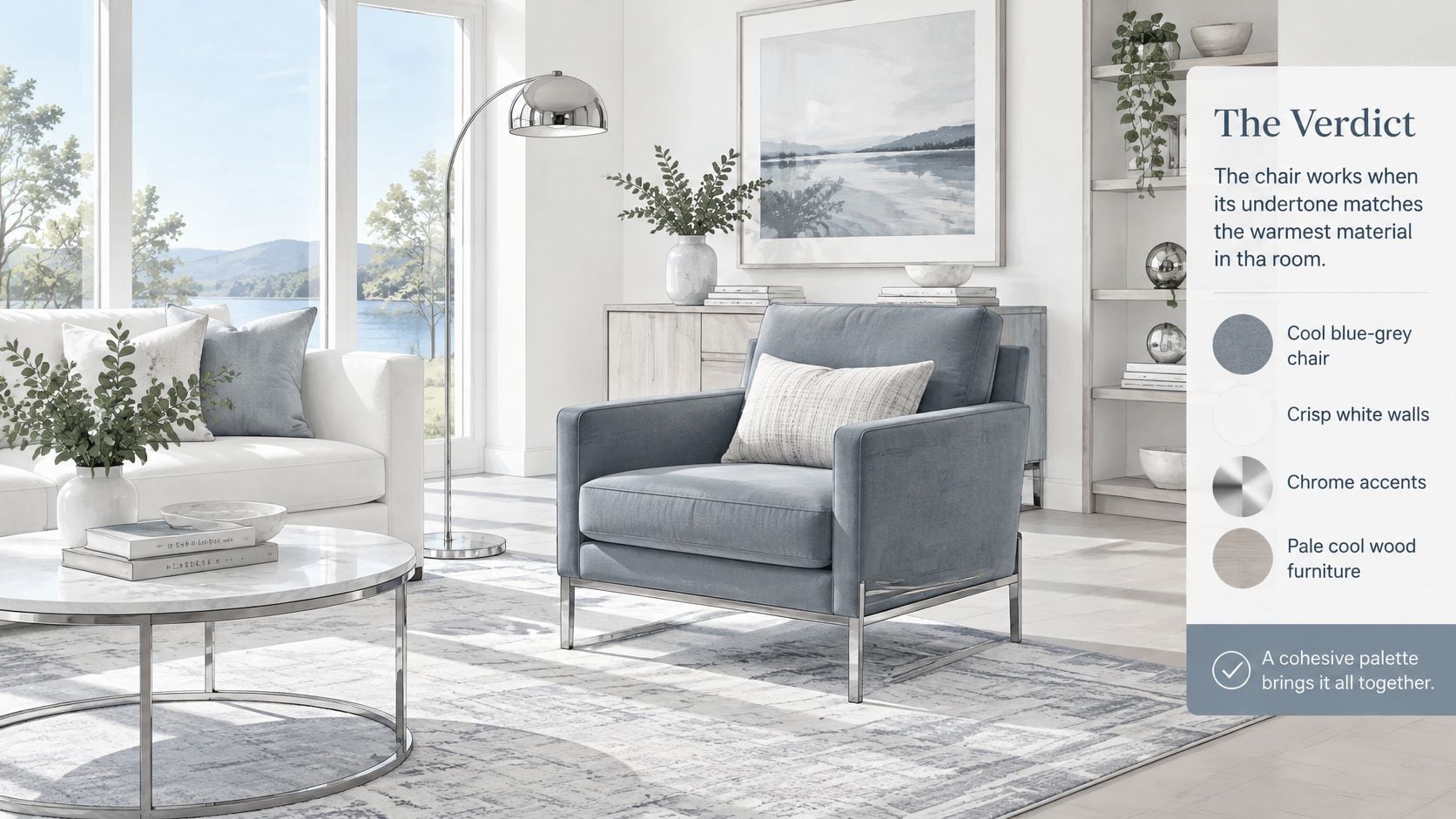
Start by naming the grey family, not just the shade name on a tag. A showroom label rarely states whether the base leans blue, beige or neutral. Hold the swatch against pure white paper, then against the floor and the sofa. The hidden colour shows up immediately.
Grey Undertones and Where Each Works
| Grey type | Undertone | Works best with | Watch for |
|---|---|---|---|
| Cool blue-grey | Blue or green | Crisp white walls, chrome, cool woods | Can look flat beside warm oak and brass |
| Warm greige | Beige or brown | Oak, walnut, linen, warm white walls | Can read muddy under cool LED light |
| Charcoal | Neutral to deep | Black metal, bold rugs, dark accents | Strong contrast; can feel heavy in small rooms |
| Textured grey | Set by yarn and weave | Boucle, linen-look, leather | Texture shows dust and lint; check the swatch in daylight |
Cool blue-grey suits crisp, deliberate rooms. It sharpens white walls and chrome, and it sits comfortably with pale, desaturated woods. Put it beside honey oak and aged brass and the chair turns icy while the wood turns orange. Neither piece is wrong. They pull in opposite directions.
Warm greige is the safer choice for most Southern Ontario homes with oak or walnut floors. It bridges linen sofas, warm white walls and natural wool without shouting. Its weakness is lighting. Under a cool LED bulb, greige loses its warmth and reads muddy grey, so bulb choice matters as much as fabric choice.
Charcoal earns its place as an anchor. It gives black metal, dark casegoods and a bold rug something solid to relate to. In a modest room, though, a large charcoal chair absorbs light and crowds the grouping. Reserve it for rooms that can carry contrast.
Textured grey in boucle, a linen-look weave or leather adapts best beside olive, terracotta and smoky blue. Texture breaks up flat colour and adds the depth a smooth grey lacks. The trade-off is practical. Loop and slub weaves collect lint and pet hair, so a household that won't brush the chair weekly should choose a tighter weave.
Test the Swatch Before Committing
Don't approve a grey from a screen or a showroom rail. Screens shift colour, and showroom lighting flatters almost everything. Guidance on matching wall colours to your style makes the same point for paint, and upholstery behaves the same way beside a wall colour. For orders placed at a distance, practical steps for avoiding colour mismatch when ordering online help reduce surprises.
- View the swatch at a north window. Winter north light pushes grey toward blue, and a shade that looked balanced in the showroom often reads darker and cooler there.
- Recheck it on a south-facing wall. Southern light warms the colour through the day, but sustained sun also fades fabric, so note where direct light lands.
- Compare morning, midday and evening. A grey that only works at noon will disappoint for most of the hours the room is used.
- Set bulbs between 2700K and 3000K. That range keeps greige warm in living spaces. Reserve 4000K for a kitchen or a focused reading corner.
- Keep the chair out of harsh afternoon sun. Unless lightfastness is high, place it in a corner or beside a lamp where it anchors conversation without fading on one side.
Practical rule: Decide first whether the chair is a quiet support or a sculptural focal point. A support chair should share the sofa's undertone. A focal chair can contrast, but only on purpose.
That decision settles the rest. A quiet chair in warm greige boucle lets art, wood and a rug lead. A sculptural charcoal chair leads itself, and everything else should step back. Problems start when a chair is bought as a neutral and then expected to perform as a statement. Choose one job, then choose the grey that does it.
How to Test Fabric and Construction Before You Buy
Grey says nothing about durability. Two chairs in an identical mid-grey can wear completely differently within two years, depending on abrasion resistance, seam construction and foam. Buyers need numbers in writing, not assurances at the rail.
Canada currently lacks a standardized test method for evaluating the fire performance of upholstered residential furniture, according to National Research Council Canada research on upholstered furniture fire performance. That means documentation has to be verified product by product. Don't assume a residential chair carries a mandatory flammability certification. Ask what has been tested.
Fabric and Construction Checks to Request
| Check | What it tells you | What to request |
|---|---|---|
| Abrasion rating | How well the fabric resists wear | Written rating from the manufacturer |
| Lightfastness | Whether the grey fades near a window | Rating for sun-exposed rooms |
| Colourfastness | Resistance to dye bleed and staining | Test documentation for the fabric |
| Seam strength | Durability at stress points | Confirmation tested on the complete chair |
| Foam specification | Cushion resilience and seat support | Foam type and density in writing |
| Frame joinery | Long-term stability under daily use | Inspection of joints before approval |
For higher-use settings such as a foyer, a reading room or seating near a rug display, prioritise fabric that meets recognised ACT upholstery performance guidelines. Ask the direct question that matters. Has the complete chair been tested, not merely the fabric bolt? A strong textile over weak seams and soft foam still produces a chair that sags and splits early.
A Four-Step Selection Workflow
- Identify traffic and sun exposure. A chair beside a front door or a south window needs higher abrasion and lightfastness than one in a seldom-used sitting room.
- Obtain the ratings. Get abrasion and lightfastness figures for the exact textile and colourway, since dyes perform differently.
- Inspect frame and cushion. Look at joinery where legs and arms meet the frame, then press the seat firmly and watch how quickly it recovers. Slow, uneven recovery signals foam that will tire.
- Approve a physical swatch at home. Judge it under the room's actual lighting, against the floor and rug, before ordering.
Two pitfalls catch careful buyers. First, a medium grey isn't automatically stain-resistant. Grey conceals dust well, but oily marks from hands and heads still show, and textured weaves retain debris in the pile. Second, leather behaves differently from woven grey. A Hancock & Moore hide develops patina and wipes clean, while a fabric absorbs spills, so ask for the leather grade alongside any fabric data. Background reading on upholstery materials and how they perform helps frame those questions before a showroom visit.
Timeless craftsmanship shows up in these unglamorous details. Tight seams, resilient foam and honest joinery decide whether a chair still looks composed after years of daily sitting. Colour gets the attention. Construction earns the longevity.
Seat Height and Clearance for Easy Daily Use
Aim for a seat height that's easy to leave, not just pleasant to sink into. The Toronto accessibility design guidelines identify a comfortable loose-seat height range of 405 to 460 mm above finished floor, with armrests and backrests recommended to support transfers and stability. For anyone who stands up from the chair several times a day, that range is the difference between independence and effort.
Low, deep lounge proportions photograph beautifully. They also drop the hips below the knees, which makes rising hard work for older homeowners and anyone with a sore knee or hip. A slightly higher, firmer chair with supportive arms delivers more everyday value, even if it looks less relaxed in a catalogue.
Seat Height and Clearance Targets
| Measure | Target | Why it matters |
|---|---|---|
| Loose-seat height | 405-460 mm above finished floor | Eases standing and sitting |
| Front approach width | At least 900 mm clear | Room to reach the chair |
| Front approach depth | At least 1500 mm | Space to step in and turn |
| Side approach | More depth than the front approach | Needed when the chair sits beside a table |
| Arms and back | Firm arms and a supportive back | Stability during transfers |
Toronto guidance also recognises at least 900 mm of clear floor width and 1500 mm of depth for a front approach, while side approaches may require substantially more depth. Treat those figures as a planning floor, not a luxury. A chair squeezed beside a coffee table for visual symmetry fails if nobody can reach it comfortably.
Run the Tape Test
- Tape the footprint and access zone. Mark the chair outline plus its approach space directly on the floor with painter's tape.
- Walk the approach. Enter from the room's main circulation path, not from the one angle that happens to work.
- Check aisles and doorways. Confirm the taped zone doesn't narrow a doorway swing or a passage to another room.
- Sit and stand in position. Use a dining chair as a stand-in and check that the arms wouldn't block a sideways transfer.
- Measure after compression. Verify seat height once the cushion is loaded, not from the catalogue specification, since soft foam can drop the effective height noticeably.
Three failures recur. A rug edge placed half under the chair creates a trip point exactly where feet land. Oversized, low arms look generous but restrict lateral movement and give no push-off support. A swivel base installed without checking its arc clips the side table every time it turns.
Choose firm, supportive cushions over very low, deep lounge proportions whenever ease of standing matters. Comfort that only works while seated isn't comfort.
These checks matter most when a statement grey chair is layered over artisanal rugs. Visual layering should never compromise movement. Keep the rug fully under the front legs or fully clear of them, and keep the approach route clear. A beautiful room that people move through cautiously hasn't been planned well.
Size the Chair Against the Sofa and the Room
Set scale before styling. A chair that's too large makes a good sofa look mean, and a chair that's too small reads as an afterthought pushed into a corner. Proportion, not colour, is what the eye registers first from the doorway.
Keep the chair back at or below the sofa back when the two sit side by side. That keeps the accent as the smaller voice in the grouping, which is its job. If a high-back chair is wanted for reading support, place it across from the sofa or at an angle, where its height reads as intentional rather than competing.
Colour depth changes perceived size. Use warm greige or textured grey in a modest room, where lighter upholstery keeps the footprint feeling open. Save charcoal for a room that can carry strong contrast and visual weight. The same instinct guides advice on staging a home in Vancouver, where oversized dark pieces quickly shrink a photographed living room.
- Let the rug carry the large pattern. A bulky chair plus a large sofa plus a busy rug creates three competing masses. One should lead.
- Protect the clearances. Arms and any swivel arc still need to leave at least 900 mm of clear width and 1500 mm of front depth.
- Match visual weight to the sofa. Open legs and a tighter back suit a fitted sofa. A fully upholstered, skirted chair pairs better with a heavier traditional frame.
Consider two outcomes beside a camel leather sofa. A smaller warm greige boucle chair sits cleanly, echoing the leather's warmth while adding texture. A deep charcoal lounge chair beside that same sofa flattens the group, because two heavy, dark masses cancel each other out.
For an awkward alcove or an unusually long room, professional help with residential space planning settles proportion before money is spent. On a bespoke custom order, width and seat depth can be adjusted in consultation so the chair fits the intended grouping, not a catalogue photograph. That's the advantage of custom furniture Southern Ontario buyers often overlook. The chair gets built around the room it will live in.
Pairing a Grey Chair with Rugs and Sofas
Start with the rug, not the chair. A rug is art for your floor, and it should establish the room's colour, texture and scale before upholstery is chosen. Critelli introduced its Rug Market in 2014, showcasing hand-knotted silk and wool rugs sourced from around the world, as noted in the Greater Niagara Chamber of Commerce daily update. That history supports a simple design order. Settle the foundation first, then select the grey chair as the quieter layer above it.
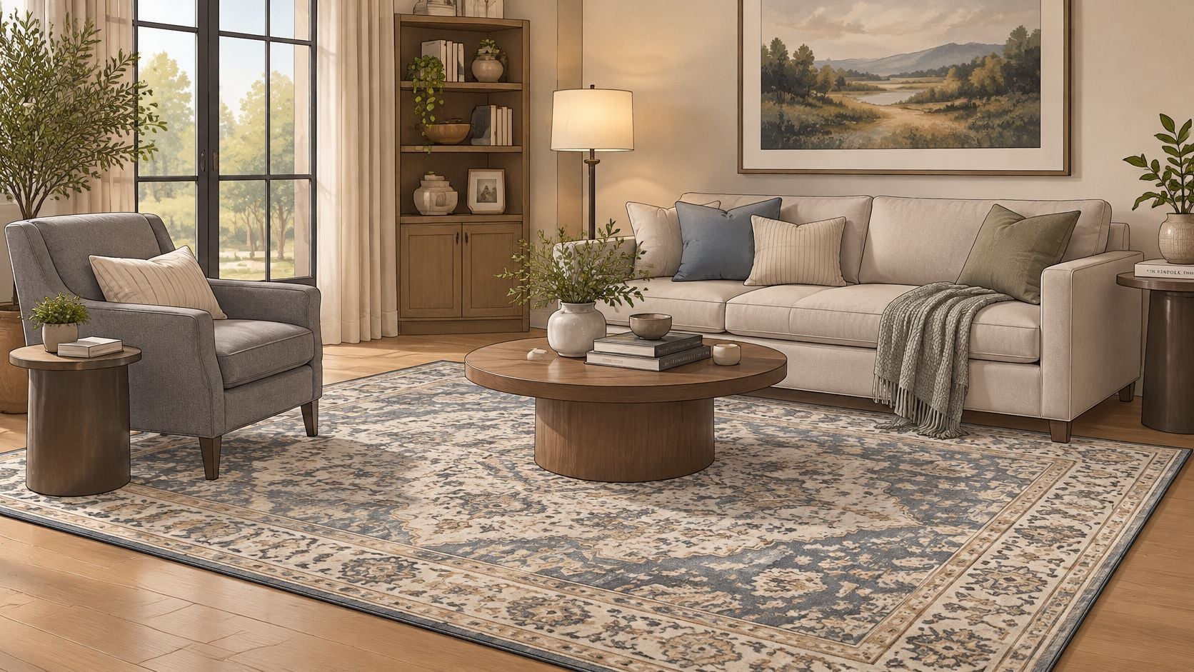
Once the rug is set, decide how the chair relates to the sofa. Echo the sofa's undertone for a calm, low-contrast room where the eye rests. Contrast it deliberately for a layered room, such as a charcoal chair against a pale linen sofa. Either approach works. Drifting between them doesn't.
Use one pattern at a time. A solid grey chair beside a patterned hand-knotted rug gives the rug room to breathe. If the chair carries a woven pattern or strong boucle texture, keep the rug quieter in pattern and let it supply warmth through wool and colour instead. Guidance on choosing a rug colour helps sequence those decisions, and the grey palette tips from CP Painting Company are useful when wall colour sits between the rug and the chair.
Say a St. Catharines couple owns a camel leather sofa they love and a living room that feels unfinished. A warm greige boucle chair picks up the leather's warmth without matching it. A hand-knotted wool rug in soft grey and rust ties the two together, because it contains both the chair's grey and the sofa's warmth. Nothing matches exactly, and that's precisely why the room settles.
Keep Metals and Woods Consistent
Metals repeat the undertone decision in miniature. Chrome and polished nickel support cool blue-grey. Aged brass and bronze support greige and warm textured grey. Mixing metals is fine in a deliberate ratio, with one finish dominant and the other used sparingly. Random mixing just looks unfinished.
Designer's Insight: Our designers suggest pairing a grey boucle chair with a neutral hand-knotted wool rug to balance the energy of the room, and let the rug carry the warmth.
That is the Art for Your Floor principle in practice. The rug supplies colour, pattern and heirloom quality underfoot. The grey chair supplies comfortable, composed seating that doesn't fight it. Reversing the order, buying the chair first and hunting for a rug to rescue it, is how rooms end up compromised.
Book a Design Consultation Before You Buy
Three checks now do the heavy lifting. Confirm the undertone against the warmest material in the room and in real daylight. Request fabric and construction documentation in writing. Verify seat height after compression and protect the approach clearance. A chair that passes all three will still look right in February and still sit well in five years.
Those checks are easier in person than on a screen. At 126 King Street, customers can compare finishes side by side, discuss wall fixings and placement, and arrange a complimentary design consultation, so a grey chair is judged beside its real neighbours rather than alone. Details on a free interior design consultation outline how that first conversation works. For those seeking luxury furniture Niagara or interior design services St. Catharines, that showroom comparison is the practical advantage.
The trust behind the advice is specific. Joseph Critelli and his son Thomas opened the original business in 1914 in Thorold, Ontario, and the company established a permanent St. Catharines location in 1961, according to the Greater Niagara Chamber of Commerce profile marking 110 years of business. Critelli Furniture remains family-owned, with fourth-generation owner Joe Critelli and fifth-generation owner Julia Critelli involved in the business. That's more than 110 years of family leadership behind a curated selection.
Critelli Furniture offers In-Home Design, Custom Order, Style Guides, Design Advice and Meet Your Designers as design services. Custom furniture orders are made to suit customers' needs, allowing fabric, finish and dimensions to be settled around an existing sofa, rug and light direction. Partner brands in the showrooms include Stickley, Stressless and Magniflex, alongside an emphasis on hand-knotted rugs Ontario shoppers can inspect in person.
After selection, Critelli Furniture offers White Glove Delivery, handling inspection, assembly, precise placement and packaging removal. That white-glove service reaches clients across the Greater Niagara, Hamilton and Toronto markets, so the chair arrives placed at the correct angle rather than boxed in a hallway.
Experience the craftsmanship in person at our King Street Showroom. Book your complimentary design consultation today. Visit the Rug Market to find your room's foundation.
Bring a floor sample, a sofa swatch and honest photos of the room's daylight, and let Critelli Furniture help match a grey accent chair to the right undertone, fabric and seat height. Its design team can plan the chair within a complete room, coordinate it with a hand-knotted rug and arrange careful placement at home. A short consultation now prevents the familiar disappointment of a grey that looked perfect somewhere else.