

How to Choose Rug Color: A Guide for 2026


You've found a rug that looks perfect under showroom lighting. At home, beside your hardwood floor and near a broad window, the same piece suddenly appears brighter, warmer, flatter, or more subdued than expected. That shift isn't a failure of taste. It's the natural behaviour of colour, fibre, surface texture, and changing light.
Learning how to choose rug colour for a Southern Ontario home means looking beyond a sofa-and-wall match. The right rug should respond to morning brightness, afternoon glare, winter daylight, evening lamps, furniture scale, and the way a household lives. A considered choice becomes more than decoration. It becomes Art for Your Floor, the visual foundation of a complete room concept.
Why Your Rug Looks Different in the Showroom Than at Home
A client may compare rugs beneath warm, even showroom lights, choose a terracotta design, and feel certain about it. Once the rug sits in a living room with large windows, that terracotta can read almost orange in afternoon sun. A neutral brown may reveal red undertones, while a soft grey may feel cooler and less welcoming than it did in the store.
The cause is simple: retail lighting controls the setting, while an Ontario home receives light from different directions and at changing intensities. In our showrooms, the same effect appears daily. Daylight from different exposures can make subdued colours look considerably more vivid than retail lighting suggests. Southern Ontario's seasonal shifts make this especially important. A colour that feels balanced in bright summer light may appear quieter, cooler, or heavier during winter afternoons.
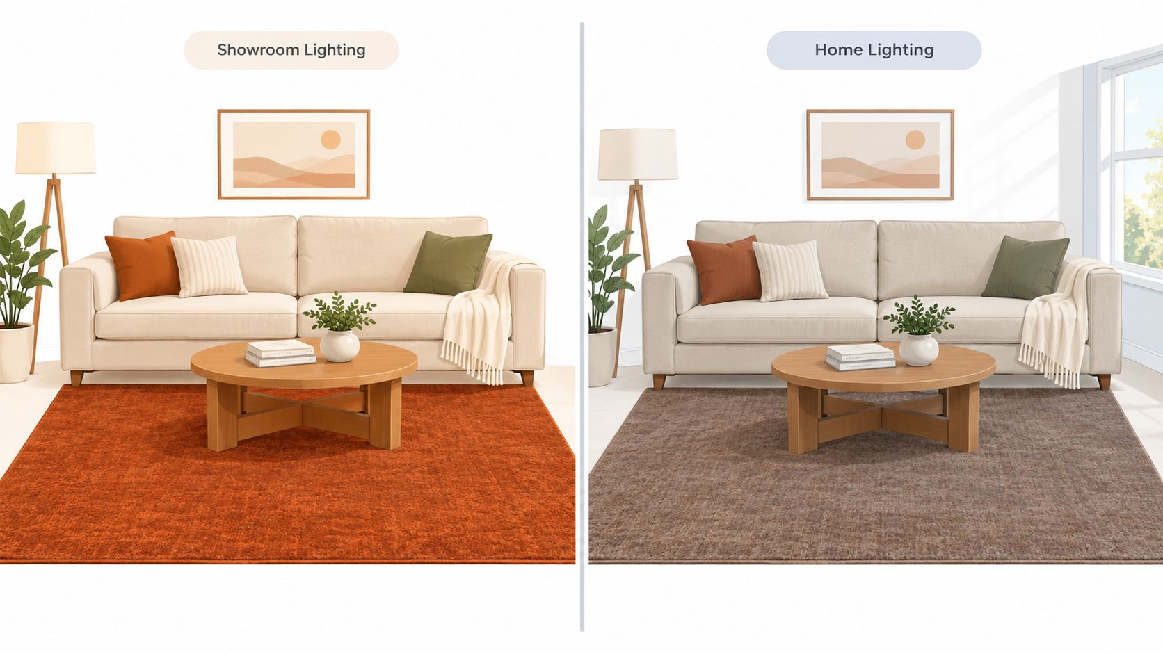
The showroom is only one lighting condition
A rug has no single, fixed appearance. Pile direction, lustre, weave, and fibre affect how the eye reads its colour. A wool rug with a subtle sheen may show one tone from one end and a deeper tone from the other. A hand-knotted design can contain several related shades that emerge gradually as daylight moves across the room.
The common mistake is approving a rug during one controlled moment. That overlooks the room's daily rhythm, particularly when windows face east, west, or south. A fully styled reference room can sharpen your judgement. This preview Chennai home interiors experience centre is geographically different from an Ontario home, but its complete rooms demonstrate how flooring, upholstery, wall colour, and daylight work together instead of presenting a textile in isolation.
Practical rule: Approve a rug in the room where it will live, not only under the lights where it was displayed.
Before choosing a shade, note the window direction, flooring colour, and surfaces that reflect light into the room. Review guidance on mood lighting for a living room as well, because evening lamps can make a rug that feels lively by day appear flatter or deeper at night. A colour that survives these changes will feel more settled over time and give the room the lasting quality expected from an heirloom piece.
Testing Rug Colour Across Changing Light Conditions
A rug approved under showroom lighting can feel unexpectedly cold, dull, or intense once it reaches an Ontario home. Test a substantial rug sample or fabric cutting in the room where it will live, and leave it there through a full cycle of daylight and evening illumination. A small sample cannot show every construction detail, but it can reveal whether the dominant colour supports the room.
A practical daylight ritual
Place the sample on the intended floor area, ideally beside the sofa, curtains, flooring, and major wood or metal finishes. Avoid testing it against a white wall alone. Colour is read horizontally, in relation to the surfaces surrounding it, and those materials can either support or distort its appearance.
Observe the sample at these points:
Morning light: East-facing windows can reveal cooler undertones. A blue-grey may appear crisp, while muted olive can read restrained and softly green.
Afternoon brightness: Direct sun and reflected light can strengthen warm pigments. Terracotta, ochre, rust, and red-leaning neutrals may look more pronounced than they did earlier.
Winter daylight: Low, cool illumination can drain warmth from a room. In a north-facing space, lighter and warmer tones can help compensate for reduced brightness.
Evening lamps: Artificial light can deepen brown, burgundy, and charcoal while reducing contrast between related neutrals. A pattern that looked defined at midday may become quieter at night.
Record what changes rather than judging the sample once. A colour that looks crisp in morning light may become flat by late afternoon, then appear deeper under lamps. That response matters more than a perfect match at one hour. An in-home colour consultation can help assess a rug beside the room's existing finishes instead of relying on a showroom impression.
Read undertones before choosing the family
Set the sample beside the floor and inspect it from standing and seated positions. Does the cream lean yellow, pink, or grey? Does the taupe contain green, red, or violet? These undertones determine whether the rug connects with the room or appears oddly separate.
Ontario's cold winter light often benefits from a warmer supporting tone, while a naturally bright room may accommodate cooler colours. A clear paint-selection resource such as our Colorado paint colour guide is also useful when wall colour and rug colour are considered together, since the undertone method applies regardless of climate. Assess the relationship between finishes, not either one in isolation. A rug that remains balanced across the day is more likely to retain its appeal as a lasting, heirloom-quality piece.
Building a Cohesive Colour Hierarchy with Existing Décor
A rug earns its place by giving the room a clear colour role, not by matching one item exactly. Begin with the elements that are difficult to change, then decide whether the rug should reinforce the palette, create measured contrast, or lead the composition.
- Architecture: Wall colour, trim, built-ins, fireplace materials, and overall visual weight establish the room's backdrop.
- Flooring: The rug needs enough difference in value or temperature to remain visible against hardwood, stone, or tile.
- Large furniture: Sofas, dining tables, cabinetry, and substantial chairs form the room's dominant visual mass.
- Textiles and art: Curtains, upholstery, cushions, and artwork offer secondary tones the rug can reference without copying.
Reinforce, contrast, or lead
A reinforcing rug gathers muted tones already present in the room. In a Southern Ontario home with oak furniture, linen upholstery, and layered textiles, warm taupe, sage, terracotta, or burnt sienna can create continuity without making every piece look coordinated. In our own project work across Southern Ontario, we are seeing a clear move toward warmer, earthier shades and away from colder, grey-heavy palettes, as discussed in our Canadian rug and interior colour trends.
A contrasting rug introduces a more deliberate colour decision. Deep olive can stand against pale walls, blue-green can sharpen warm wood, and a red-based accent can give a restrained room greater energy. The surrounding furniture should have enough composure to let that contrast remain intentional rather than competitive.
A leading rug functions as the room's artwork. Echo one of its colours sparingly in a cushion, ceramic piece, framed textile, or small accent. Repeating a secondary tone usually feels more refined than reproducing the entire pattern.
Designer's Insight: A bold Hancock & Moore leather sofa often benefits from a neutral hand-knotted wool rug. The rug grounds the leather's presence, adds tactile depth, and keeps the room's energy balanced rather than competitive.
Let the room decide the level of expression
Patterned upholstery generally calls for a quieter rug, particularly when the furniture already carries strong scale or colour. A room with solid upholstery and plain curtains can support an artisanal pattern with more movement. Use the colour hierarchy to control that movement, especially as Ontario's daylight shifts through the seasons.
The rug should connect the room's character without repeating every element. A restrained group of earth-tone colour palettes can establish that hierarchy when the goal is timeless craftsmanship rather than a short-lived colour statement. Test the relationship beside the actual furniture and finishes, then choose the colour that remains convincing across changing light.
Choosing Between Light and Dark Rugs for Spatial Effect
Colour value changes the perceived shape of a room. A lighter rug reflects more visual light and can make a space feel open, while a darker rug adds weight and intimacy. Neither choice is better by default. The right direction depends on the room's proportions, flooring, windows, and intended mood.
| Desired effect | More suitable direction | What it does |
|---|---|---|
| Airiness and visual openness | Light rug | Softens the floor plane and helps the room feel more expansive |
| Definition and intimacy | Dark rug | Gives the seating area weight and makes a larger space feel contained |
| Warmth without heaviness | Mid-tone earth colour | Adds character while preserving flexibility |
| Quiet continuity | Textured neutral | Connects finishes without demanding attention |
When a lighter rug works
A light rug can be particularly effective over dark hardwood. The contrast separates the seating area from the floor and gives the room a clearer sense of flow. In a compact sitting room, a pale cream, sand, or warm taupe design can create visual breathing room, especially when the furniture is substantial.
The risk is choosing a pale rug with no texture or tonal variation. It may disappear beside light upholstery and pale walls, or show every piece of lint as a sharp interruption. A softly patterned or tone-on-tone construction gives the light palette enough depth to remain intentional.
A sun-filled dining room may also benefit from a light rug when the design goal is reflective and composed. The rug should still have enough contrast with the floor to define the table and chairs.
When a darker rug earns its place
A darker rug can make a broad living room feel more gathered. Charcoal, chocolate brown, deep teal, burgundy, or dark olive can anchor furniture that otherwise seems scattered across a large floor. Deeper colours also help establish a cocooning mood in a reading corner or intimate lounge.
The drawback appears when the room is already dim or the rug sits close in value to dark flooring and upholstery. The palette can collapse, making the floor feel heavy and reducing the definition between objects. In those rooms, a mid-tone rug with lighter pattern movement may provide grounding without closing in the space.
The decision should follow atmosphere, not fashion. A rug is successful when its value supports how the room should feel at its most important daily moment.
Balancing Style with Durability in High-Traffic Homes
Families often begin with a colour question and end up making a performance decision. A pale rug can brighten a busy family room, yet a flat light surface may expose every mark. A dark solid rug can disguise soil, while lint, pet hair, and shifts in pile direction may stand out against it.
The practical choice is usually a colour family with texture, pattern, or controlled variation. Distressed vintage effects, layered construction, and tone-on-tone surfaces can soften the appearance of everyday wear while keeping the design intentional. In our Rug Market, we often point clients toward performance elegance, weathered finishes, and tonal texture for active households.
Match the construction to the room
A family room, hallway, or entrance needs a rug that can handle repeated movement and regular maintenance. A hand-knotted wool rug may provide the resilience and long-term character expected in a lasting design. Textured or subtly patterned surfaces are often more forgiving than a single, uninterrupted colour.
Hand-tufted rugs can suit these spaces as well, provided the construction is well finished. Compare the density, surface definition, backing, and overall feel rather than judging the rug by colour alone. Our guide to whether hand-tufted rugs are good quality helps clarify what to examine before choosing one.
Use pattern as practical elegance
A low-contrast pattern breaks up the appearance of dust and minor marks without making the rug compete with the room. Speckled neutrals, faded motifs, and tonal geometry work well beneath coffee tables, in family seating areas, and along routes between rooms.
Ontario's changing daylight also affects how forgiving a rug appears. A colour that looks evenly textured in a showroom can reveal stronger contrast beside winter window light or warmer variation later in the day. Test samples in the room, and view them after cleaning, during busy hours, and under the lighting used at night.
The strongest choices balance three needs:
- Visual tolerance: Variation softens small signs of daily use.
- Material suitability: Fibre and pile should match the traffic and cleaning routine.
- Aesthetic longevity: The rug should remain appropriate when accessories and upholstery change.
A rug that ages gracefully reduces the pressure to replace it when the room's upholstery changes, which is a practical test of a timeless choice.
Bringing Your Vision to Life with Bespoke Design Support
Rug colour becomes easier to choose when the decision is treated as part of a complete room concept. The question isn't only which shade looks attractive. It's whether the rug supports the architecture, complements the furniture, responds to the home's changing light, and suits the household's daily habits.
A design studio can help make those relationships visible. At Critelli Furniture, the process can include reviewing fixed finishes, comparing rug samples in context, and coordinating a room with furnishings from brands such as Stickley, Stressless, Magniflex, Hancock & Moore, and Century. The aim is a bespoke result, not a room assembled from isolated purchases.
A considered process protects the investment
A useful consultation should address:
- Light: How the rug changes from morning through evening and across seasonal conditions.
- Palette: Which tones should recede, connect, or provide a focal point.
- Lifestyle: Whether children, pets, entertaining, or quiet use will shape the material choice.
- Scale: How the rug supports the furniture arrangement and defines the room.
- Delivery: How the piece will move from selection to final placement without unnecessary disruption.
Critelli's family-run history reaches back to 1914, and that century-old perspective encourages a slower, more personal approach to furnishing. For homeowners seeking luxury furniture in Niagara, interior design services in St. Catharines, custom furniture in Southern Ontario, or hand-knotted rugs in Ontario, proximity to the Greater Niagara, Hamilton, and Toronto markets makes an in-person review practical.
The Rug Market treats rugs as Art for Your Floor, with hand-knotted and artisanal pieces that can serve as the foundation of a room's palette. A white-glove service can then support the transition from showroom to home through inspection, assembly, placement, and removal of packaging. That continuity matters when a rug is intended to become an heirloom rather than a temporary accent.
The collaborative design process gives clients a way to refine the room with professional guidance while keeping personal taste at the centre. The result should feel collected, warm, and uniquely individual, with every colour chosen for how it behaves in real life.
Experience the craftsmanship in person at our King Street Showroom, where a curated selection of artisanal rugs and complete room furnishings can be considered in context. Book your complimentary design consultation today, or visit the Rug Market to find your room's foundation through Critelli Furniture.