CRITELLI'S SUMMER SALE | UP TO 70% OFF



Earth Tone Color Palettes for a Grounded, Timeless Home

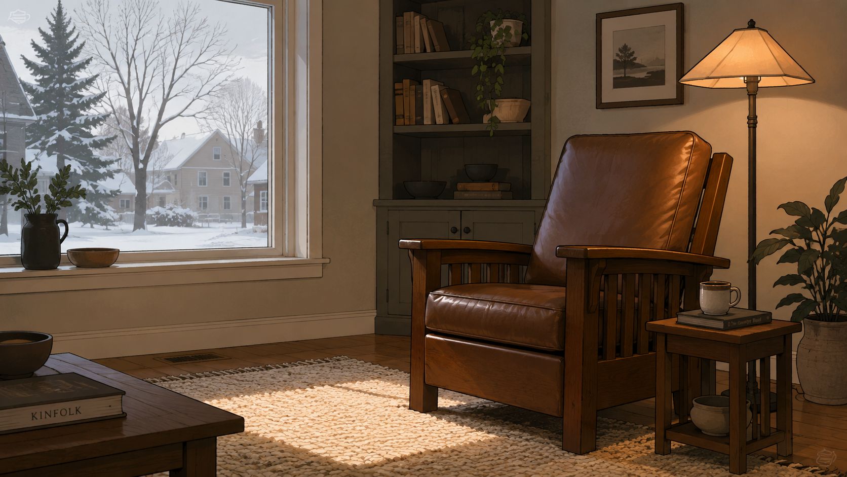
A January morning in St. Catharines can make a living room feel smaller than it is. Grey light sits low on the wool rug, a lamp warms a leather chair, and the room suddenly reveals what colour really does, it doesn't just decorate, it changes the air around the furniture.
Why Earth Tones Feel Different in a Southern Ontario Home
In Southern Ontario, earth tone color palettes behave like materials, not just pigments. A taupe wall, a terracotta throw, or an olive chair can read calm in a showroom and then look flatter or cooler once winter light comes in at a different angle, especially in north-facing rooms. That's why a thoughtful room in St. Catharines, whether it's serving the Greater Niagara, Hamilton, or Toronto market, needs more than a pretty swatch.
Colour behaves differently when daylight is scarce
The usual online advice often treats earth tones as if they perform the same way everywhere. In a Canadian home, that misses the point. Winter daylight changes how surfaces read, so the same muted brown can feel elegant on a leather sofa, then subdued on a broad wall if the room lacks contrast and texture.
A heritage-minded retailer treats that as a design issue, not a paint-chip issue. The room has to work as a complete room concept, where walls, upholstery, rugs, and lighting support one another instead of competing. That is why a complete design studio conversation tends to start with the whole room, not one colour alone.
For homeowners comparing finishes, a useful reference point is a broader design lens on living spaces, like the guidance in biophilic interior design, because earth tones already rely on natural materials and natural light to feel balanced.
Practical rule: in a dim room, earth tones need enough contrast to stay legible. If everything is the same softness and the same temperature, the room can blur together.
That same logic explains why design decisions made for a sunny apartment can fail in a winter home. A colour that looks relaxed in July may need a deeper companion in January, especially when the room is furnished with heirloom quality pieces in wood, leather, wool, and stone. For homeowners who want the palette to feel grounded rather than washed out, the material story matters as much as the colour story.
And when the room needs a digital starting point before a showroom visit, a planning tool like ai for garden design can remind homeowners that good design always starts with context, light, and site conditions, whether the space is outdoors or indoors.
A local palette should feel curated, not trendy
Earth tones are not a fad in this region. Their cultural weight comes from history, from natural materials, and from the fact that they continue to feel stable in Canadian homes that need warmth through long seasons. In a well-styled room, that stability reads as calm, durability, and understated luxury.
A curated selection of earth tones should therefore work with the furniture, not against it. A deep sofa, a hand-knotted rug, and a modest lamp can do more for the room than a saturated paint choice alone. That is the logic that makes earth tones feel different in Southern Ontario, and it's the same logic that keeps them relevant in design-forward interiors today.
What Earth Tones Actually Are
Earth tones begin much earlier than many might assume. One established design source notes that ochre was used by prehistoric peoples as early as 75,000 years ago, with engraved ochre pieces found at Blombos Cave in South Africa dated to that period, which makes these colours part of the oldest human colour materials rather than a recent stylistic preference Shutterstock design earth colours palette.
A working definition starts with the material world
In contemporary colour guidance, earth tones are usually defined as hues inspired by soil, rock, clay, wood, and foliage. That includes browns, beiges, muted greens, terracottas, and grays, along with related tones such as tan, umber, burnt sienna, warm gray, and moss-like greens Suncity Lincoln Hills earth tone colour chart.
That definition matters because it gives the palette a boundary. Earth tones are not just “anything neutral.” They are muted colours that carry the memory of natural materials, which is why they tend to feel stable in a home rather than decorative for the sake of decoration. A brown that feels grounded in upholstery may look flat in a wall colour if the rest of the room lacks variation.
The first technical idea is chroma management. In practical terms, a credible earth palette usually stays in a reduced saturation range, roughly 15 to 45%, so the hues remain recognisable without looking synthetic or overly vivid Earth tone palette guide. Low chroma is especially useful around wood grain, stone, rug fibres, and upholstery texture, because it lets those materials stay visible.
Design note: earth tones work best when they feel muted, not weak. The goal is restraint with presence, not colour that disappears.
Value gives the palette its structure
The second technical idea is value, which means the light-to-dark ladder inside the scheme. A strong earth palette usually has a light base, a middle layer, and a dark anchor, rather than a row of colours that all sit at the same depth Earth tone palette generator guidance.
That ladder is what keeps a room from feeling muddy. A sand wall, a taupe sofa, and an espresso table can work together because each has a role. If every surface lands in the same middle value, the eye has no rest point and the room loses shape.
For interiors, the best test is simple. If a taupe sofa looks calm but the same taupe on a wall feels flat, the issue is usually not the hue, it's the value relationship. Earth tones unify through reduced saturation and a clear light-to-dark range, which is why they can feel both timeless and perfectly suited in the same room.
Three Named Palettes for Three Different Moods
A homeowner usually doesn't need “more earth tones.” The need is a palette with a job. One room needs brightness, another needs warmth, and another needs depth, so the colour set has to match the light and the furniture it lives with.
Quiet Hearth
Quiet Hearth suits north-facing rooms and any space that needs reflected brightness without losing warmth.
- #F4E9D8 Sand
- #E8D3B8 Oat
- #D8C2AA Cream clay
- #B9A28A Mushroom taupe
- #7E6A57 Weathered walnut
- #4B3B31 Espresso trim
This palette leans soft and luminous, but it still has enough depth to keep the room from drifting into beige fog. It works well when the furniture includes wool, linen, or a mid-tone leather, because the lighter range catches what little daylight a winter room has to offer.
Sun-Warmed Terracotta
Sun-Warmed Terracotta works best in south- and west-facing rooms where afternoon light already brings energy.
- #C56E4B Terracotta
- #D79A3A Ochre
- #C8A35B Amber
- #8A6B3C Sanded bronze
- #54613A Deep olive
- #2F241D Burnt bark
This palette has more personality. The red-orange side keeps the room warm, while olive and bark tones stop it from becoming overly cheerful. It pairs naturally with wood furniture and textured textiles because the colours already echo the tone of natural materials.
Deep Forest
Deep Forest belongs in studies, dining rooms, libraries, and other rooms that benefit from depth.
- #35261F Espresso
- #49413C Charcoal
- #5E5A4A Smoked taupe
- #405043 Dark moss
- #6C5A46 Bark brown
- #C7B8A3 Quiet linen
This palette feels enclosed in a good way. It gives a room a more intimate envelope, especially when the furniture includes wood, leather, and a rug with visible texture. The lighter linen note keeps the scheme from becoming oppressive.
Designer's Insight: a bold leather sofa paired with a hand-knotted wool rug keeps earth tones from flattening out. The leather adds structure, the rug adds visual depth, and the two together make the room feel finished.
| Palette | Core Hex Codes | Mood | Best Room Orientation |
|---|---|---|---|
| Quiet Hearth | #F4E9D8, #E8D3B8, #B9A28A, #4B3B31 | Calm, light, reflective | North-facing |
| Sun-Warmed Terracotta | #C56E4B, #D79A3A, #8A6B3C, #54613A | Warm, lively, grounded | South and west-facing |
| Deep Forest | #35261F, #49413C, #405043, #C7B8A3 | Intimate, dimensional, composed | Low-activity, depth-seeking rooms |
For anyone mapping out a room digitally, a palette tool such as create your palette can be a useful way to compare how a lighter base, mid-tone, and dark anchor behave before any paint is ordered.
Applying Earth Tones Room by Room
The same palette can feel elegant in one room and underpowered in another, so the job of colour is always tied to use. A living room needs conversation and comfort, while a bedroom needs softness and rest. A dining room benefits from a little drama, and an entryway needs a confident first impression.
Living room, dining room, bedroom, entryway
In the living room, start with a neutral wall and let the upholstery carry more weight. A deeper sofa or chair in clay, taupe, or olive gives the room a centre, while a textured rug softens the transition between furniture and floor. The result feels complete rather than overly coordinated.
In the dining room, wood does a great deal of the work. A stickley-inspired table in a warm finish can pull a cooler-leaning palette back toward balance, which is especially useful when the room has strong daylight or polished surfaces. The palette does not have to be dramatic to feel composed, it just needs one honest natural anchor.
In the bedroom, quieter chromas belong at the centre. Linen, oatmeal, muted sage, and smoked taupe support rest because they do not visually shout from wall to wall. A room like that reads as restful when the bedding, drapery, and rug stay within the same soft family.
In the entryway, a darker anchor helps the space feel intentional. A charcoal bench, dark olive console, or espresso mirror frame can ground a transitional zone that otherwise feels visually thin. That little bit of depth carries the eye into the rest of the home.
The most reliable way to keep each room coherent is to tie the palette to the furniture first, then shape the paint around it. That is where a complete room concept matters, because a colour story should never float apart from the materials that live inside it.
Upholstery and soft goods should do different jobs
A useful place to think this through is with fabric layers. Upholstery can carry the room's middle value, while cushions and throws can either brighten or deepen the edges. A homeowner who wants a more artisanal feel can mix wool, linen, leather, and weave rather than relying on a single smooth finish.
For those who like a decorative plant in the same room, a practical side note on care for indoor cacti is a reminder that a room's visual calm often comes from low-maintenance natural elements that don't compete with the furniture. A well-placed plant should support the palette, not steal from it.
A room feels more refined when each surface has a role. Walls can recede, upholstery can ground, rugs can connect, and accents can finish the edges.
That approach is why earth tones work so well in custom furniture Southern Ontario homes, where people often want furniture that fits both the room and the way the room is used. A bespoke piece in the right tone can solve more than colour, it can solve proportion and comfort at the same time.
For those thinking through layouts as well as colour, the guidance in interior design space planning can be a useful companion, because a strong palette still needs the furniture placed with intention.
Lighting, Texture, and Finish Working Together
Earth tones succeed or fail on more than hue. In a Southern Ontario home, light, texture, and finish decide whether the room feels layered or flat. Winter daylight can drain subtle colours, so the palette needs enough contrast to stay legible when the sun is weak and the room depends on lamps.
Light direction should decide the depth of the palette
A north-facing room usually asks for a slightly stronger mid-tone or a warmer accent so it doesn't look drained. A south- or west-facing room can take more colour without losing clarity because the light already gives the palette energy. The room's orientation is not a footnote, it is part of the palette.
That is why extremely desaturated colours can disappoint in winter. If the walls, sofa, rug, and drapery all sit too close together in value and temperature, the room can feel washed out rather than calm. A slightly richer clay, olive, or bark tone often reads better because it preserves shape.
Texture keeps muted colours from going dull
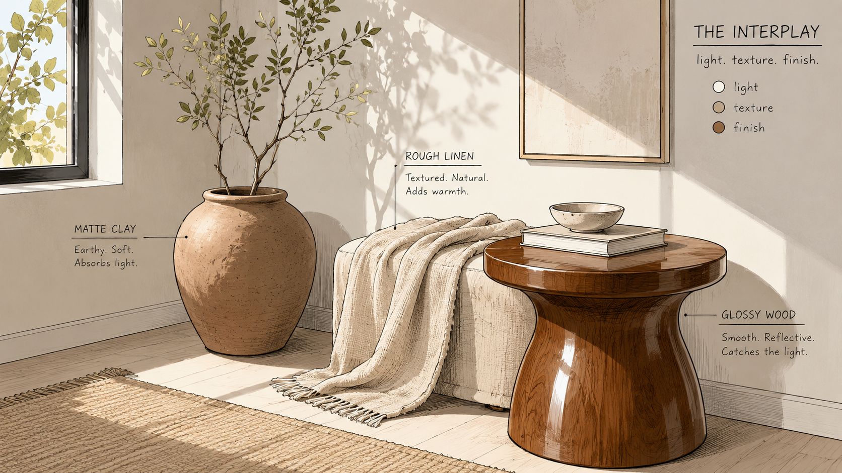
Texture is the part many people underestimate. Smooth leather beside hand-knotted wool, or woven jute beneath a polished wood table, gives the eye something to travel across. Without that variation, even a beautiful earth palette can feel one-note.
Matte clay-washed walls, softly polished stone, brushed wood, and woven textiles all support the same family of colours without making the room feel repetitive. The room stays coherent because the finishes share a natural temperature, yet each surface still reflects light differently.
Practical rule: choose the colour, then test the texture, then check the finish. If two out of three are too similar, the room often loses depth.
This is why Hand-knotted rugs Ontario homeowners choose so often become the visual stabiliser in the room. A rug naturally carries multiple tones, which helps the rest of the finish story make sense without forcing every surface to match.
The same thinking applies to Interior design services St. Catharines clients who want more than a decorating exercise. The room has to hold up under real daylight, real winter weather, and real daily use, which means colour, texture, and finish must be considered together from the start.
For homeowners exploring a room with softer overhead light, a pendant can also shape the mood. The guidance in ceiling pendant lights can help frame how light falls across walls, tables, and rugs, especially where the room needs a warmer evening atmosphere.
Building Your Palette Around a Rug Foundation
A rug is often the most honest starting point in an earth-toned room because it already contains the full value ladder. The best hand-knotted wool rugs carry lights, mids, and darks in one heirloom piece, so the rest of the room can borrow from that structure instead of guessing at it.
Let the rug choose the room's language
A rug's dominant tone can guide the wall colour, while its secondary tones can suggest upholstery and accents. If the rug leans warm, a clay or sand wall may feel natural. If it includes darker moss or espresso notes, those colours can reappear in a chair, a frame, or a side table.
That is why the Rug Market matters so much in an earth-tone scheme. A rug is not an afterthought or a filler piece. It is often the foundation that lets the rest of the room feel organised, especially when the homeowner wants a space that reads as artisanal and timeless rather than assembled.
A room built this way tends to feel calmer because the rug has already done the work of coordinating tone, value, and temperature. The furniture doesn't need to fight for attention; it can sit within the palette the rug established.
A rug-first room stays coherent
The strongest rug-led rooms usually follow a simple pattern. The wall colour stays quieter than the rug, the upholstery takes a tone from the rug's middle range, and one accent references the darkest thread or border. That keeps the palette readable without making it rigid.
It's also the most reliable way to support an art for your floor mindset without turning the room into a gallery. The rug becomes the visual base, but the furniture finishes the story through shape and material.
Design note: when the rug already contains three or four related tones, the rest of the room only needs to repeat them with discipline. That is enough to make the palette feel bespoke.
For homeowners who want help choosing proportions rather than just colour, how to choose an area rug size is a sensible next consideration, because a beautiful rug still has to fit the room properly if it is going to anchor the palette.
That logic is especially valuable in Luxury furniture Niagara homes, where the rug often has to connect larger pieces, more formal seating, and a broader visual field. A floor foundation makes every other choice easier.
Bringing It All Together with a Critelli Consultation
A homeowner standing in a fully styled showroom room often notices the same thing, the palette feels settled because nothing is working alone. The wall tone, the rug, the upholstery, and the lighting all speak the same language, and the room looks finished before a single extra accessory is added.
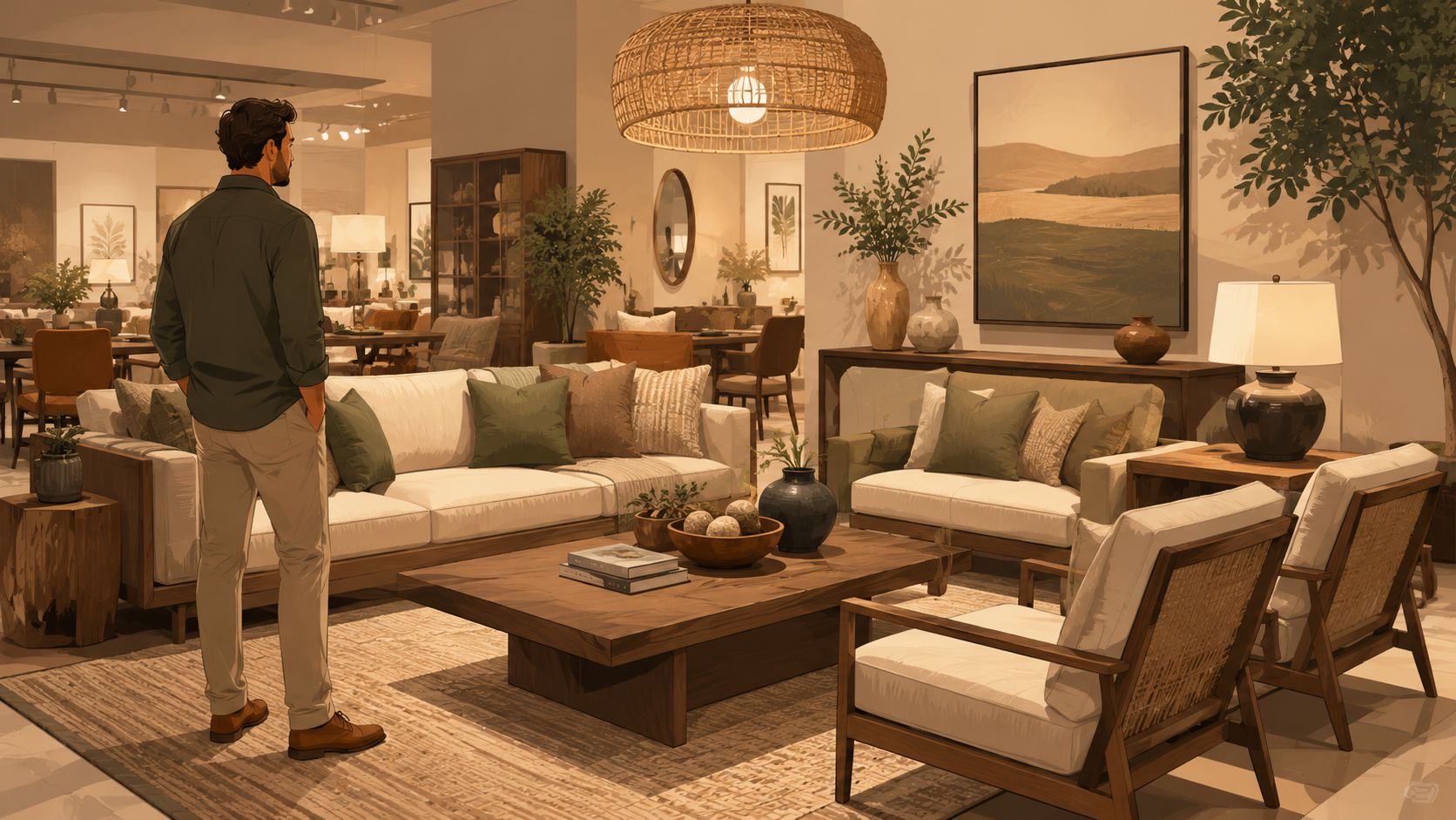
That is the value of a design studio approach. A complimentary consultation, an in-home visit when needed, professional space planning, and bespoke fabric and leather selection all help the homeowner see the room as one composed environment rather than separate purchases. In a family-run setting with a 1914 legacy, that process feels less like retail and more like a careful handoff from one stage of the home to the next What is included in an interior design consultation.
The same attention carries through to white-glove delivery across the Greater Niagara, Hamilton, and Toronto markets, which matters because the final placement is part of the design, not an afterthought. When the rug, sofa, and table land in the right order, the earth-tone palette can finally read the way it was meant to.
Book your complimentary design consultation today and experience how a curated selection of furniture, rugs, and finishes can turn earth tone colour palettes into a grounded, timeless room. Visit Critelli Furniture to experience the craftsmanship in person at the King Street Showroom, and visit the Rug Market to find your room's foundation.