
Dining Room Lighting Pendants: An Expert Guide

A dining room rarely fails because of the table alone. More often, it feels unfinished because the light above it is off in scale, too harsh at supper, or visually disconnected from the room around it.
That’s why dining room lighting pendants deserve more thought than they usually get. In Southern Ontario homes, especially across St. Catharines, Niagara, Hamilton, and the GTA, the right pendant has to do several jobs at once. It has to light faces well, flatter materials, respect ceiling height, and sit comfortably within the architecture, whether that architecture is a Victorian home with generous windows or a newer build with cleaner lines and an open plan.
At Critelli, we’ve spent generations helping clients think in complete rooms, not isolated pieces. A pendant is never just a fixture. It becomes part of the room’s rhythm, alongside the dining table, the chairs, the rug, the window light, and the mood you want when people gather.
The Art of Illumination More Than Just a Light Fixture
The difference shows up the moment dinner starts.
A well-chosen pendant draws the table into focus. It gives the meal a centre. It softens the room beyond the table edge. It also changes how wood grain, china, linen, and skin tones read in the evening. A poor fixture does the opposite. It glares, drops too low, or disappears into the ceiling plane.

In our part of the province, homeowners have been paying closer attention to that distinction. Pendant lighting pendants have seen a 45% increase in installation rates from 2015 to 2025 in Southern Ontario, tied to strong renovation activity, according to lightideas.com’s pendant lighting history reference. That shift feels familiar to us. Since 1914, our family-run business has watched dining rooms move from formal-only spaces to rooms used every day, and the light above the table has become more deliberate with each generation.
Why pendants matter in a dining room
A pendant has presence without the ceremony of a large traditional chandelier.
That’s often what clients want now. They still want beauty, but they also want clarity and restraint. One sculptural fixture, or a disciplined row of pendants, can feel more design-forward than an ornate centrepiece while still offering timeless craftsmanship.
A dining room pendant also works like jewellery. It doesn’t carry the whole outfit, but it can define it.
Practical rule: If the room feels flat at night, the problem often isn’t the furniture. It’s the light quality, the fixture scale, or both.
The complete room matters
At Critelli, we don’t treat lighting as a separate decision from furniture. The pendant has to belong to the full composition.
That means looking at the table shape, chair height, rug pattern, millwork, window placement, and sightlines from adjacent rooms. It also means understanding whether the room needs quiet elegance or a stronger focal point. A pendant can support either one, but only if the proportions are resolved first.
For homeowners thinking beyond the dining room, this broader approach to layered interiors is useful in other spaces too. The same principle applies when you put your living room in the best light. A room becomes memorable when lighting and furnishings are chosen as one conversation.
Finding the Perfect Fit Sizing Your Pendant Lighting
You notice sizing errors the moment a pendant goes up. In a compact Toronto semi, a fixture that looked generous in the showroom can disappear over a long dining table. In a heritage Niagara home with tall trim, deep window casings, and high ceilings, that same fixture can feel even smaller once the architecture starts competing with it.
Start with the table, not the ceiling box
The table should establish the scale.
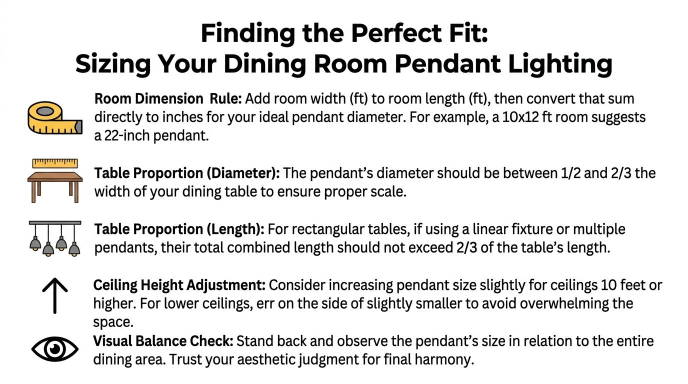
A widely used guideline from the American Lighting Association’s sizing recommendations is to choose a fixture that stays comfortably narrower than the table, with enough presence to anchor it visually. In practice, for a standard 72 x 42 inch six-seat table, that usually puts a single pendant somewhere around 1/2 to 2/3 of the table width.
That rule works because diners read the fixture in relation to the tabletop first. The ceiling box matters far less.
Use these working proportions:
- For a single pendant: target a diameter around 1/2 to 2/3 of the table width
- For longer tables: use two or three pendants instead of one oversized piece
- For visual balance: keep the fixture inside the table edges, with breathing room on each side
Table shape changes the answer
Rectangular, round, and square tables do not want the same solution.
Rectangular tables
Rectangular tables usually suit either one linear fixture or a row of pendants. I use multiple pendants most often when the table is long and the room itself has a strong horizontal pull, such as a modern open-concept home in Burlington or Oakville where the dining area sits between a kitchen wall and a bank of rear windows.
Spacing matters, but proportion matters more. If the pendants are too small, the row looks busy rather than intentional. If they are too large, the composition becomes heavy and starts competing with the chairs and sightlines.
Round tables
A round table usually calls for one centred pendant with enough width to hold the middle of the room.
This is often the cleanest answer in older Southern Ontario homes where the dining room is more enclosed and symmetry carries a lot of the charm. One fixture respects that geometry and keeps the room settled.
Square tables
Square tables allow a little more flexibility. One pendant often works well. A compact cluster can also succeed if the fixture has a clear overall shape and does not sprawl beyond the table’s footprint.
The room should decide which direction is better. In a crisp contemporary space, a cluster may feel right. In a room with traditional millwork or original plaster details, one disciplined fixture is often stronger.
Visual weight changes perceived size
Diameter is only part of the story.
Two pendants can measure the same across and read completely differently once installed. That is especially true in Southern Ontario homes where natural light changes sharply by season. Clear glass can look almost weightless on a bright summer afternoon, then nearly vanish at dusk against large dark windows. An opaque metal shade holds its presence far more consistently.
Use this quick comparison when judging scale:
| Fixture type | How it reads | Sizing instinct |
|---|---|---|
| Open-frame metal | Airy, architectural | Can often go slightly larger |
| Opaque metal | Strong, focused | Keep close to the core sizing range |
| Clear glass | Visually light | Needs enough actual size to hold presence |
| Fabric or woven shade | Soft, broad | Watch the edge spread over the table |
Designer’s Insight: In homes with tall windows, detailed trim, or dark winter sightlines, I often specify a pendant with more visual substance than the table measurements alone would suggest. Architecture and daylight conditions change how large a fixture feels.
One large pendant or a series
The better question is not which option looks more luxurious. The better question is which one fits the table shape, the room width, and the architecture around it.
Choose one pendant when:
- The table is compact
- The room is symmetrical
- You want one strong focal point
Choose multiple pendants when:
- The table is long
- The room has a linear layout
- You want light and visual weight distributed more evenly
If you’re comparing fixture size to the table itself, standard furniture dimensions help keep the decision grounded. This guide to standard dining table heights and proportions is a useful reference point before finalizing scale.
Mistakes that throw the room off
A few sizing errors come up repeatedly.
- Choosing by showroom impression alone: Large retail ceilings distort scale.
- Ignoring shade width: Many homeowners focus on fixture height and miss the horizontal spread.
- Using a decorative mini pendant as the only source: It may be attractive, but it rarely has enough presence over a dining table.
- Oversizing for drama: A statement fixture still needs clearance, proportion, and visual discipline.
The right size feels settled from the day it is installed. It suits the table, respects the room, and still holds its own on a grey January afternoon or in full summer light.
Mastering Height and Placement for Flawless Ambiance
Once the size is right, installation decides whether the pendant feels effortless or irritating.
Height is where many dining rooms go wrong. A beautiful fixture can still be a daily annoyance if it cuts across sightlines, throws glare into someone’s eyes, or hangs so high that it loses intimacy over the table.
The standard rule that still holds
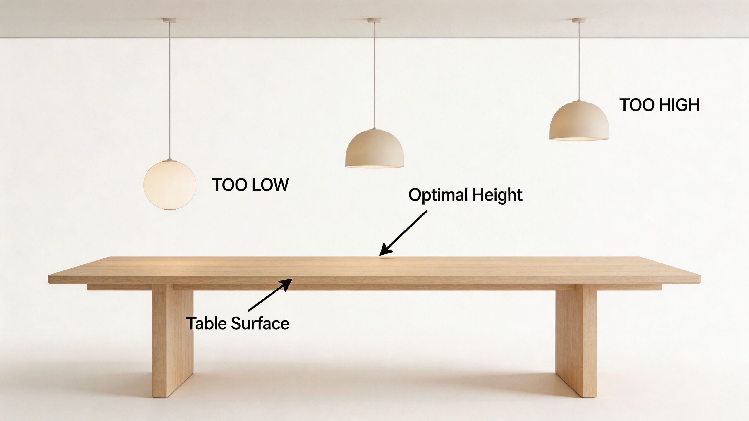
For most dining rooms, pendants should hang 30 to 36 inches above the tabletop.
That guideline remains dependable because it balances visibility, atmosphere, and comfort. You can still see the person across from you. The light stays connected to the table instead of floating uselessly near the ceiling. The fixture also feels like part of the dining experience, not an afterthought.
In Southern Ontario homes with 9 to 10 foot ceilings, the drop should be adjusted by adding 3 inches for every foot of ceiling height over 8 feet. A 9 foot ceiling, for example, calls for a 33 to 39 inch drop, based on this pendant height guidance.
Heritage homes need a different eye
This matters in older homes across Niagara, Hamilton, and parts of Toronto.
A room with taller ceilings, larger windows, and deeper trim often needs a pendant to sit slightly lower relative to the overall room volume, but still not so low that it interrupts conversation. Heritage architecture can make a fixture look oddly adrift if it’s installed by modern builder-grade habits.
That’s one reason in-home review matters. Ceiling height on paper doesn’t tell you what crown depth, window head height, or adjacent sightlines are doing in person.
In a dining room, the pendant should relate to the table first and the ceiling second.
Placement over rectangular tables
The geometry needs to be precise.
For a single fixture, centre it to the table, not to the room. That distinction matters in open-concept layouts where the table may be offset from beams, windows, or traffic paths.
For multiple pendants:
- Find the table centreline
- Set each fixture along that line
- Keep spacing even
- Check sightlines from seated positions
- Confirm that the composition feels centred to the furniture, not to the electrical box alone
If placement is off by even a small amount, the room can feel unsettled. People may not know why, but they’ll feel it.
Placement over round tables
Round tables are less technical, but less forgiving visually.
A single centred pendant is the clearest answer. If a cluster is used, the entire grouping must act as one visual mass. Randomised heights can be beautiful, but they need discipline. In a dining room, casual becomes messy very quickly when the table below is formal in shape.
What white-glove precision changes
Good installation is not just electrical work. It’s visual calibration.
Our team handles furnishings with a white-glove mindset, and that same attention belongs in pendant placement. The final result depends on measured drop, fixture centring, room balance, and how the table sits once chairs are in place. The most successful rooms are adjusted to lived reality, not just plan drawings.
If you’re still refining the furniture layout itself, it helps to settle the table choice before finalising the fixture position. This guide on how to pick the right dining room table can help clarify proportion and placement.
Common installation misses
These are the ones we see repeatedly:
| Mistake | What happens |
|---|---|
| Hanging too high | The room loses warmth and focus |
| Hanging too low | Sightlines break and glare increases |
| Centring to the room instead of the table | The composition feels subtly wrong |
| Uneven spacing in a multi-pendant run | The tabletop light looks patchy |
| Ignoring adjacent views | The fixture looks awkward from the hall or kitchen |
A pendant should never make itself known by being inconvenient. If people notice it constantly during dinner, something about the placement likely needs attention.
Creating Harmony with Finishes Materials and Style
A pendant can be perfectly sized and perfectly hung, then still feel out of place.
That usually comes down to finish, material, and tone. The light above the table has to speak to the furniture below it, and to the architecture around it. Not by matching everything exactly, but by belonging to the same design language.
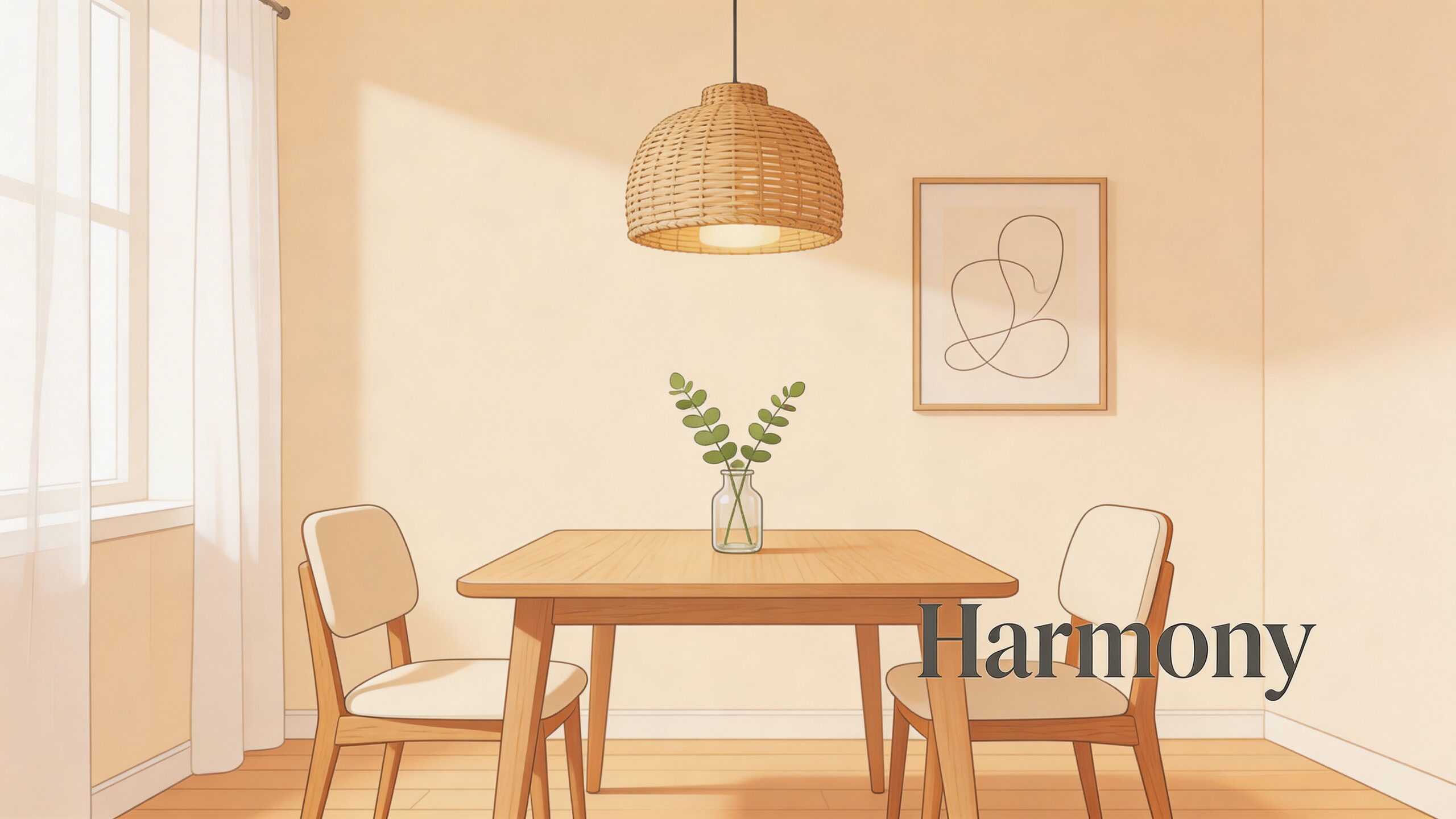
Match the mood, not every surface
A dining room with a Stickley table doesn’t need a pendant that imitates the table’s finish.
It needs a fixture that respects the table’s character. Quarter-sawn oak, for example, often pairs beautifully with aged brass, bronze, muted black, or hand-finished glass because those materials have substance. A very glossy chrome pendant may work in some transitional rooms, but it can also feel disconnected if everything else in the space has depth and patina.
The same principle applies in more contemporary rooms. Clean-lined furniture often welcomes contrast. Matte black over warm wood can feel crisp. Soft nickel with pale upholstery can feel restrained and refined.
Heritage architecture changes finish choices
In Southern Ontario heritage homes, natural light is rarely consistent across the year.
That’s where bulb quality and finish selection begin to overlap. For these homes, high-CRI LEDs above 90 are recommended to preserve true colour rendition, even with Niagara’s 40% annual cloud cover, as noted in this pendant lighting FAQ reference. In practical terms, that means walnut, cherry, painted millwork, artwork, and textiles won’t go dull or grey under the fixture.
Finish also matters in changing daylight. A highly reflective metal can become sharp in bright summer conditions near large windows. A softer finish often behaves better. In winter, when daylight is limited and cooler, a pendant with richer materiality can keep the room from feeling stark.
Choose a pendant for how it looks at noon in January and at dinner in July. Southern Ontario homes ask for both.
Build a complete room concept
The Design Studio perspective matters most here.
A pendant should relate not just to the table, but to the chairs, sideboard, wall colour, and rug. The rug is especially important. We often describe it as Art for your Floor because it establishes the room’s emotional register. If the rug is intricate and painterly, the pendant may need restraint. If the rug is quiet and tonal, the pendant can carry more personality.
Consider how these combinations read:
- Traditional table with hand-knotted rug: a pendant in antique brass, opal glass, or a well-fitted linen shade often feels settled
- Modern table with sculptural chairs: blackened metal, smoked glass, or a geometric form can sharpen the composition
- Organic room with woven textures: natural fibres, plaster-like finishes, or soft matte surfaces can keep the room relaxed
- Mixed-era dining room: a simpler pendant often bridges old and new better than an ornate one
Contrast can be better than matching
Rooms become memorable when there’s tension, but controlled tension.
A rustic table under an overly rustic pendant can feel predictable. The better move may be a refined silhouette above a textured surface. Likewise, a sleek modern table sometimes benefits from a pendant with artisanal character so the room doesn’t feel cold.
One option available in the St. Catharines market is the Euclid 6 Light Nickel Cube Pendant through Critelli’s modern offering. It suits rooms that want an architectural, open-frame presence rather than a shaded or opaque look. It’s one example of how a fixture can function as structure, not just decoration.
For broader style direction, this overview of dining room styles to fit every home can help clarify which pendant vocabulary belongs with your furnishings.
A brief material guide
| Material or finish | Best suited to | Watch for |
|---|---|---|
| Aged brass | Traditional, transitional, heritage homes | Too much yellow if surrounding finishes are cool |
| Matte black | Modern, rustic-modern, graphic interiors | Can feel harsh in very delicate rooms |
| Glass | Airy rooms, smaller dining areas, layered schemes | Needs the right bulb and clean maintenance |
| Woven or natural fibre | Casual, organic, coastal-influenced spaces | May reduce crisp task light |
| Nickel or polished metal | Refined, urban, contemporary rooms | Reflection and glare near large windows |
When clients want help resolving those relationships, the answer usually isn’t another online search. It’s seeing materials together. Book your complimentary design consultation today if you’d like a more bespoke, room-wide perspective that includes furniture, lighting, and the rug beneath it.
Illuminating Details Bulbs Dimmers and Long-Term Care
After the fixture is chosen, daily performance comes down to three details. The bulb, the dimmer, and maintenance.
These aren’t glamorous decisions, but they shape how the room feels every evening. A beautiful pendant with the wrong bulb can turn elegant millwork grey. A fixture without a dimmer often feels too bright for dinner and too dim for setting the table.
Bulbs that flatter the room
For most dining rooms, warm light is the goal.
That usually means staying in the warm LED range rather than choosing a cooler bulb that feels clinical. In practical terms, warm light is kinder to wood, more inviting on skin tones, and more suitable for long evenings around the table.
When selecting bulbs, focus on these three terms:
- Kelvin: This tells you the colour temperature. For dining spaces, warmer light generally feels better than cooler light.
- Lumens: This tells you brightness. The fixture should feel bright enough for dining, but not exposed.
- CRI: This tells you how accurately colours appear under the light. Higher CRI matters when you want finishes, fabrics, and food to look natural.
Why dimmers are essential
A dining room does more than one job.
It hosts family meals, holidays, homework, late coffee, and conversations that drift long after the plates are cleared. One fixed light level can’t serve all of that well. A dimmer can.
Installing dimmable LED pendants can lead to energy savings of up to 55% in dining spaces, and this approach is now standard in 92% of Critelli’s interior design lighting plans for clients in St. Catharines and Hamilton, according to this pendant light reference.
If you’re evaluating the practical side of the upgrade, a straightforward guide on how to install a dimmer switch is a useful starting point for understanding the process before you speak with a qualified electrician.
Lower light for dining isn’t just about mood. It reduces glare on glassware, softens shadows across faces, and makes the whole room feel more composed.
Care that protects heirloom quality
Pendant maintenance depends on material.
For glass shades
Dust first. Then clean with a soft cloth and a suitable glass cleaner applied to the cloth, not sprayed directly into the fixture area.
For metal finishes
Use a dry or barely damp microfibre cloth. Aggressive cleaners can strip patina or leave uneven shine.
For fabric or woven shades
Keep dust under control with a soft brush attachment. These materials hold airborne residue more easily than metal or glass.
A few habits help every fixture:
- Turn power off before cleaning
- Check screws and suspension points periodically
- Replace mismatched bulbs together, not one at a time
- Clean shades before dust hardens into film
Accessories matter too. Candlesticks, centrepieces, and mirrors all interact with pendant light, so they should be chosen with the same care as the fixture itself. If you’re refining the room around the table, this look at dining room accessories every space needs can help.
Your Vision Illuminated at Critelli
The right dining room pendant doesn’t succeed because it’s fashionable. It succeeds because it feels resolved.
It fits the table. It sits at the proper height. It respects the architecture. It works in morning light, winter cloud, and evening conversation. Most of all, it makes the room easier to live in and better to gather in.
That’s the standard we believe in after more than a century of serving Southern Ontario homes. Since 1914, our perspective has been shaped by generations of clients who wanted more than a transaction. They wanted guidance. They wanted rooms that felt personal and lasting. They wanted choices rooted in timeless craftsmanship rather than passing taste.
What clients are really choosing
When homeowners visit us from Niagara, Hamilton, or the Greater Toronto market, they’re often not just looking for a pendant.
They’re trying to solve a room. The dining table may need to relate to adjacent seating. The rug may need to anchor both colour and scale. The fixture may need to work with heritage trim or a newer open-concept plan. Those decisions are easier when they’re handled as one composition instead of scattered purchases.
That’s where a design-forward process changes the outcome.
- The Design Studio helps shape a complete room concept, so lighting, furniture, and materials feel intentional together.
- The Rug Market gives the room its foundation. A hand-knotted rug often settles palette and proportion before the pendant is chosen.
- White-glove service ensures the transition from showroom to home feels considered, not improvised.
- A century-old family legacy brings continuity to the process. We’ve seen what lasts.
What timeless work looks like
Timeless doesn’t mean conservative.
It means the room still feels right after the novelty wears off. A bespoke dining room with artisanal finishes, heirloom quality furniture, and a carefully chosen pendant should feel calm, layered, and lived in. Not over-styled. Not under-considered.
That’s especially true in Southern Ontario, where homes vary so much from one neighbourhood to the next. A downtown heritage property in St. Catharines asks different things of a pendant than a newer custom home outside Hamilton. A room with deep mouldings and tall windows won’t behave like a minimalist condo dining area. Both can be beautiful. They just require different judgement.
The final measure
A successful dining room doesn’t announce every design decision.
It feels good to enter. The table is inviting. The pendant belongs. The rug grounds the room. The chairs look and feel right. The lighting supports the moment, whether that moment is a holiday dinner or takeaway on a Tuesday night.
That’s the kind of home we care about helping clients create.
Experience the craftsmanship in person at Critelli Furniture. Visit our King Street Showroom to explore a curated selection of lighting, heirloom quality furnishings, and hand-knotted rugs designed for complete-room living across Niagara, Hamilton, and Toronto. If you’d like personalized guidance, book your complimentary design consultation today and let our team help bring your dining room vision into focus.