CRITELLI'S SUMMER SALE | UP TO 70% OFF



In Home Color Consultation Guide for Timeless Interiors


A homeowner chooses a beautiful paint chip at the shop, carries it home, and watches it change character on the wall. The soft neutral now looks faintly blue beside the window, while the “clean white” appears unexpectedly yellow near a favourite lamp. Nothing is wrong with the paint. The room is revealing information that a small card under showroom lighting can't show.
That's why an in home color consultation begins with the house itself. Orientation, daylight, lamps, flooring, upholstery, cabinetry, trim, and artwork all influence how colour is perceived. For Southern Ontario homeowners, a considered palette isn't a list of fashionable shades. It's a curated selection that belongs to the architecture and remains graceful through changing seasons.
Introduction to a More Confident Way to Choose Colour
A well-chosen colour should feel settled, not merely attractive for a few minutes. A north-facing sitting room in St. Catharines may need a different neutral from a sun-filled room in Niagara-on-the-Lake, even when both homeowners want a quiet, heritage-aware interior. The same paint can also behave differently beside walnut, pale oak, aged brass, a charcoal sofa, or a hand-knotted rug.
An in-home visit allows a designer to study those relationships in their proper setting. The conversation can move beyond “Which colour is popular?” toward more useful questions. Should the wall support an heirloom cabinet? Does the room need warmth in winter daylight? Will the selected finish sit comfortably beside existing drapery and flooring?
This approach suits the way Critelli's Interior Design Studio treats furniture. A sofa, rug, lamp, and wall colour belong to a complete room concept, rather than a collection of unrelated purchases. The family-run company has served Southern Ontario since 1914, giving its design guidance a long relationship with local homes, traditional craftsmanship, and evolving ways of living.
A homeowner doesn't need to arrive with a perfect answer. The consultation is designed to clarify preferences, identify practical constraints, and translate inspiration into a palette that feels personal. A useful starting point is this expert guide to creating the perfect colour palette, especially for homeowners who have saved many images but haven't yet found the common thread.
The journey is reassuringly tangible. A designer observes the rooms, tests colour in changing light, considers the furnishings that should remain, and shapes a direction that can support future decisions. The result isn't a trend imposed on the home. It's a bespoke framework for living well in it.
What an In Home Color Consultation Really Means
An in home color consultation is a light-first design service conducted in the actual room where the colour will live. Rather than selecting a shade from a generic online palette, the designer studies the home's architecture, natural light, finishes, furnishings, and intended atmosphere before recommending a direction.
The easiest analogy is tailoring. A fabric may look exquisite on a display table, yet its success depends on the person wearing it, including complexion, proportions, and surrounding colours. Paint works similarly. Undertones, sheen, and light temperature determine whether a neutral feels creamy, stony, green-leaning, or violet-leaning once it meets the room.
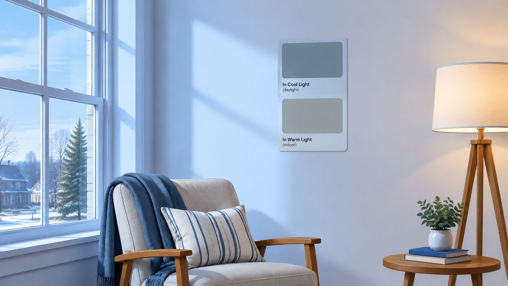
The elements a designer evaluates
A thoughtful consultation usually considers:
- Undertone: The subtle colour beneath a neutral that becomes more visible beside other finishes.
- Light direction: The way window orientation and seasonal daylight affect warmth, coolness, brightness, and depth.
- Artificial lighting: The effect of bulbs and fixtures used after sunset.
- Surface relationships: The way flooring, cabinetry, upholstery, rugs, artwork, and trim alter the appearance of a wall.
- Finish and sheen: The degree to which a surface reflects light and changes the apparent intensity of a shade.
A digital palette can inspire, but it can't fully reproduce the room's reflective surfaces or the way a colour changes from morning to evening. The value of the consultation lies in interpretation. The designer connects technical observations with the homeowner's wishes, whether those involve a calm bedroom, a more welcoming entertaining room, or a restrained backdrop for heirloom quality furniture.
Designer's Insight: A neutral should be chosen beside the room's most influential fixed finish, often the flooring or cabinetry, not in isolation on a white counter.
That principle is central to Critelli's design philosophy. Furniture can be customized through fabrics, leathers, and finishes, while colour helps unify those choices with the architecture. Homeowners seeking a fuller explanation of the service can review what's included in an interior design consultation.
The finished recommendation may include a primary wall colour, supporting shades, trim guidance, and accent directions. It can also identify colours that look appealing in theory but conflict with the room's existing light or materials. That honesty is part of bespoke service. A successful palette doesn't photograph well. It feels right when the room is used every day.
Why Colour Behaves Differently in Southern Ontario Homes
A colour chosen at noon can look entirely different by supper. Southern Ontario homes move through cool northern daylight, bright winter conditions, and warmer evening illumination, so the same painted surface develops a different character across the day. Orientation matters first. A north-facing room may make a cool neutral feel distant, while a warmer undertone can bring back the comfort homeowners expected.
This effect extends beyond the walls. Flooring, cabinetry, upholstery, metal, and wood all reflect light into one another. A pale shade beside honey-toned oak may appear gentler than it does beside blue-grey flooring. The room's existing finishes act like surrounding voices, changing how loudly or softly a colour speaks.
Artificial light introduces another layer. Kelvin temperature describes the appearance of a light source, and that setting influences walls, fabrics, and finishes after sunset. Around 2700K, whites can look yellow and greys may shift toward purple. 3000K to 3500K often provides a more balanced residential impression. Canadian guidance on northern light and sample testing supports viewing colour at different times of day, rather than trusting one observation (Canadian guidance on the Northern Light Effect).

Why the post-grey palette needs local interpretation
Colour direction has moved beyond the cool greys that shaped the previous decade. A Canadian renovation-colour guide identifies greige, warm tan neutrals, espresso browns, sages, blue-greens, and terracotta accents as current directions, while a restorative approach favours grounding tones with a lighter quality (Canadian renovation colour guidance).
These families can feel current without becoming disposable, provided they are adjusted to the room. Sage may settle beautifully beside warm oak yet appear cold beside blue-grey flooring. Terracotta can add depth to a pale room, but may feel heavy with dark cabinetry and weak evening light. Espresso brown can create an enveloping library, while a brighter space may need a softened version.
The practical lesson is simple: trends provide vocabulary, while the home determines grammar. For homeowners exploring earth-tone colour palettes for a grounded interior, orientation and fixed finishes should guide the final selection.
Kelvin temperature belongs in the decision
Samples need to be judged in daylight and under the lighting planned for the room. Guidance places 3500K to 4500K in a generally neutral range, while 5000K to 6500K can appear cooler and more clinical (lighting temperature guidance).
Large samples beside flooring, upholstery, cabinetry, and trim reveal the full relationship. That careful comparison prevents a familiar mistake: choosing a colour in one kind of light, then living with a noticeably different room after dark.
How Your In Home Consultation Unfolds Step by Step
A consultation becomes easier to trust when each stage answers a practical question. What should the room feel like? How does its light change? Which finishes must the colour respect? The process gives homeowners a clear route from first impressions to a palette that belongs to their Southern Ontario home.
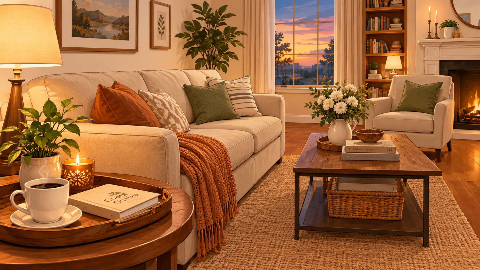
The first conversation establishes direction
The process begins by booking a complimentary design consultation. The opening discussion covers the room under consideration, the homeowner's priorities, existing pieces, renovation timing, and the atmosphere the space should create. It also clarifies whether the priority is better morning brightness, a calmer evening mood, or a colour that connects adjoining rooms.
That conversation gives the designer a brief before any sample is chosen. Colour matching then becomes part of a larger room decision, rather than an isolated search for a fashionable shade.
The home visit makes the room the evidence
The designer studies the room in person, one space at a time. Window placement, orientation, ceiling height, sightlines, fixed finishes, and existing furniture all affect how a colour will read. A pale neutral beside warm oak may feel welcoming, while the same sample beside cool flooring can appear sharper.
The visit also records how the room changes through the day. Daylight and artificial lighting work like different filters over the same fabric, revealing shifts that a quick showroom glance cannot show.
Samples are assessed where they will live
Large-format samples provide a more useful reading than small chips. The designer places them on more than one wall, observes them in natural daylight, and checks them under the room's planned lighting. Adjacent finishes remain visible because rugs, stone, metal, wood, upholstery, and trim all influence the apparent colour.
The goal is to understand the shade's range. A successful choice remains comfortable as the room moves from morning sun to evening lamps, rather than appearing identical at every hour.
The presentation turns observations into a room concept
The follow-up may take place in the showroom, where the homeowner reviews the palette beside furniture, upholstery, rugs, and other finishes. A two-consultation design process, beginning with an in-home visit and continuing with an in-store presentation that may include 3D renderings, shows how site observations can become a visual plan (two-consultation design process).
Critelli's collaborative design process keeps the discussion centred on how the room works as a whole. The palette can be considered alongside case goods, seating, leather, mattresses, or a rug selected as part of the room's foundation. Each element is tested for proportion, texture, and colour relationship before the homeowner decides what belongs together.
The final direction may be deliberately restrained. A considered selection often gives a room greater longevity than several competing statements.
How to Prepare Your Home for the Best Results
The most useful preparation begins with observation. Notice how the room feels in morning light, afternoon glare, winter's softer daylight, and evening lamp light. A few notes about these shifts give the designer better evidence than a folder of unrelated inspiration images.
Photographs can still help. Choose rooms whose atmosphere appeals to you, then look for patterns: warm neutrals, deep greens, quiet blues, or terracotta accents. The aim is to describe the feeling you want, not dictate an exact paint colour before the room has been assessed.
A practical checklist for consultation day
- Record orientation: Note whether the main windows face north, south, east, or west.
- Gather samples: Keep flooring, fabric, rug, cabinetry, stone, and trim samples available.
- Photograph the room: Include windows, adjoining spaces, artwork, and major furniture.
- List fixed elements: Identify what will remain, what may change, and what must be accommodated.
- Check the lamps: Record the Kelvin information printed on bulbs or packaging.
- Mark inspiration: Select a small group of images that express atmosphere rather than exact paint colour.
Lamp details deserve a close look. The Kelvin rating helps show whether evening light will read as warmer, cooler, or closer to daylight. Recording the bulb information lets the designer consider the room after sunset, when a colour that felt balanced at noon may shift beside a lamp.
Existing finishes provide equally valuable context. Leather, wood, stone, upholstery, metal, and rugs all affect how a wall colour appears. A warm wall may support the character of Hancock & Moore leather, while a quieter neutral can give Stressless seating or Stickley woodwork room to speak. An artisanal rug from the Rug Market, treated as Art for Your Floor, may establish the room's depth before the wall palette is chosen.
Bring the home as it is lived in. Leave meaningful furniture, artwork, and textiles in place so the consultation reflects real relationships rather than an empty shell. Homeowners preparing a property for marketing may also review virtual staging articles for agents for ideas about presenting rooms clearly. A private consultation has a different purpose: it should reveal the home's authentic character and the conditions that will shape colour every day.
Real Rooms and Results That Show Colour in Context
Colour becomes easier to understand when it is attached to a room with real objects. A wall is never experienced as a floating rectangle. It sits behind a sofa, meets a floor, reflects a window, and changes beside artwork.
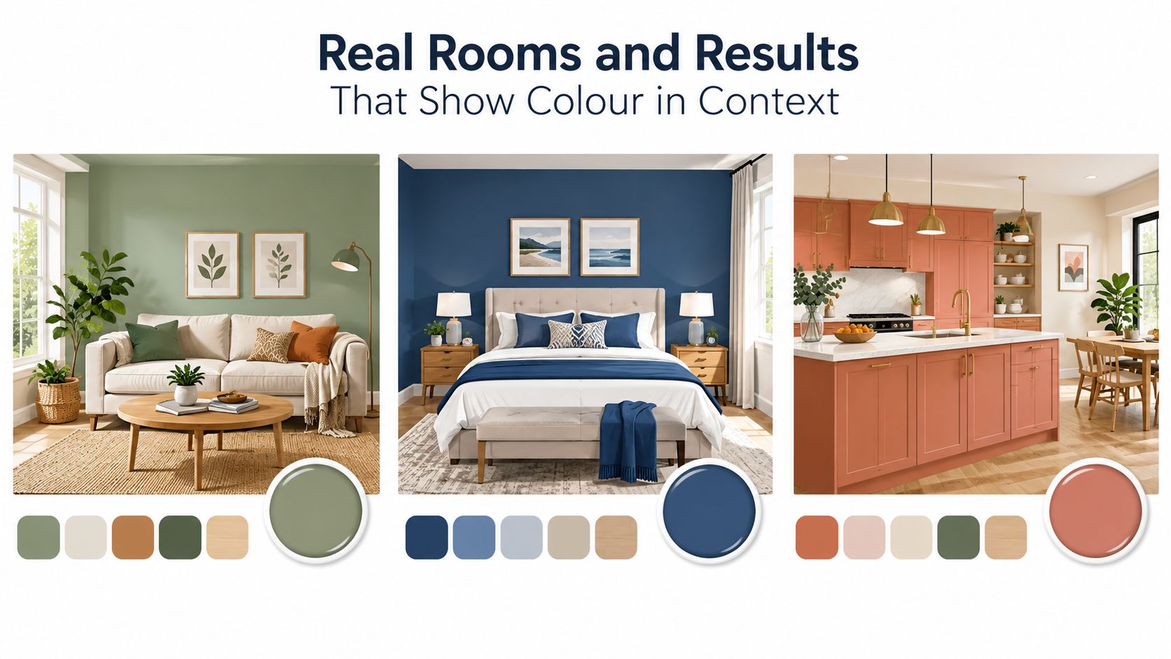
A living room with collected warmth
A King Street-inspired living room might begin with warm greige walls, selected to soften the transition between daylight and evening lamps. A bold Hancock & Moore leather chair can then provide depth, while a hand-knotted wool rug introduces pattern without making the room feel busy.
The rug does more than cover the floor. It acts as the visual bridge between the wall, upholstery, wood, and metal. At Critelli's Rug Market, the concept of Art for Your Floor places the rug at the centre of the complete room concept, rather than treating it as a final accessory.
A bedroom with quieter contrast
A bedroom may call for a muted sage that sits comfortably beside existing flooring and natural linen drapery. Terracotta can appear through a cushion, ceramic lamp, or small textile accent, giving the room warmth without requiring a dramatic wall treatment.
The designer tests the sage beside the actual floor and fabric. If the floor carries a pink or orange cast, the green may need a more considered balance. If the drapery is cool and pale, a warmer sage can prevent the room from becoming overly distant.
A heritage room with deeper colour
In a library or dining room, espresso brown may create the enveloping atmosphere the architecture deserves. The shade must still be evaluated against trim, ceiling colour, artwork, and the room's evening lighting. A large sample can reveal whether the brown feels polished and intimate or too dense.
Designer's Insight: A bold colour often becomes more timeless when its surrounding materials are allowed to remain quiet. The rug, wood tone, and upholstery should support the wall rather than compete with it.
This kind of room-by-room thinking also helps homeowners prioritise projects. Guidance on rooms to stage first can prompt useful questions about which spaces carry the greatest visual importance. In a private home, the same principle applies to colour. The first room to address should be the one that shapes the daily experience or connects most strongly to adjoining spaces.
Bring Your Palette Home With Critelli Expertise
A palette becomes convincing when it belongs to the house, not to a trend board. In a Southern Ontario home, daylight, room orientation, architecture, furnishings, and evening lighting all influence colour. An in home color consultation lets these relationships be observed before paint, furniture, rugs, or lighting become costly commitments.
Critelli's Interior Design Studio brings a family-run design tradition established in 1914 to this process. Its guidance connects colour with space planning, custom fabrics, leathers, finishes, and furniture, allowing a room to feel collected rather than assembled. Homeowners considering softer accents can also explore easy floral colour ideas for the home, then assess those hues under the light their rooms receive.
The studio develops complete room concepts for homes across the Greater Niagara, Hamilton, and Toronto markets. A wall colour can be considered beside crafted wood furniture, upholstered seating, leather, sleep products, or a hand-knotted rug selected as the room's foundation. Existing finishes remain part of the colour reading. A warm floor can change how a pale wall feels, while cooler upholstery may call for a warmer supporting tone.
The work continues after the palette is selected. Delivery can include placement in the room of choice, unpacking, assembly when needed, and packaging removal. These details help the selected furnishings arrive ready for the room's intended arrangement, rather than leaving homeowners to manage every final step themselves.
A personal conversation is the practical next decision. Homeowners can explore Critelli's free interior design consultation and return to the materials, daylight, orientation, and daily routines that make the house distinctive.
Experience the craftsmanship in person at our King Street Showroom. Book your complimentary design consultation today. Visit the Rug Market to find your room's foundation.
Critelli Furniture offers light-aware in-home colour guidance alongside curated furniture, custom selections, and artisanal rugs for complete room concepts. Visit Critelli Furniture to arrange a thoughtful consultation and see how bespoke colour can support timeless craftsmanship in a Southern Ontario home.