CRITELLI'S SUMMER SALE | UP TO 70% OFF



8 Jewel Tone Color Palettes for Timeless Interiors

A Legacy of Colour: Embracing Jewel Tones in Your Home
A sapphire chair in a neutral room can change the entire conversation of a space. It doesn't just add colour. It establishes mood, hierarchy, and a sense of intention that lighter palettes often struggle to deliver.
In a world of fleeting trends, the allure of rich, saturated colour remains timeless. Jewel tone color palettes, inspired by precious gems like sapphire, emerald, and ruby, offer a path to creating interiors with depth, personality, and lasting elegance. Since 1914, Critelli Furniture has helped families across Southern Ontario move beyond the ordinary, curating homes that feel layered, personal, and built around heirloom quality pieces rather than short-lived styling decisions.
That long view matters with colour. California's postwar design culture made vivid interiors more visible during the 1940s to 1960s, and the state's population rose from about 10.5 million in 1950 to 15.7 million in 1960, a 49% increase that helped drive demand for expressive residential colour choices and modern furnishings during that growth period. Rich accent palettes became part of a broader modern living aesthetic, especially in homes with more natural light and more open plans.
For Southern Ontario homes, the lesson still holds. Jewel tones work best when they're treated as part of a complete room concept, not as isolated colour moments. Flooring, rugs, wood finish, upholstery, lighting, and metal accents all have to speak to one another. That's also why a strong starting point, whether a sofa, a rug, or even guidance on how to choose flooring color, often leads to a more coherent result than selecting paint first.
Table of Contents
- 1. Sapphire & Gold The Classic Jewel Tone Foundation
- 2. Emerald & Blush The Contemporary Jewel Tone Statement
- 3. Amethyst & Charcoal The Sophisticated Jewel Tone Drama
- 4. Ruby & Cream The Warm Jewel Tone Classic
- 5. Teal & Bronze The Transitional Jewel Tone Bridge
- 6. Topaz & Mahogany The Warm Jewel Tone Richness
- 7. Peridot & Slate The Fresh Jewel Tone Modern
- 8. Garnet & Ivory The Jewel Tone Heritage Palette
- 8 Jewel-Tone Palette Comparison
- From Concept to Completion Your Bespoke Interior Awaits
1. Sapphire & Gold The Classic Jewel Tone Foundation
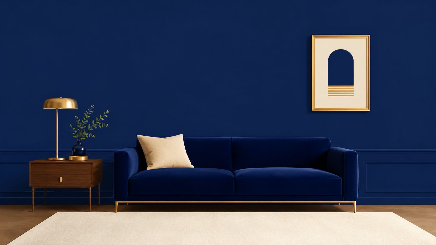
Sapphire and gold remains one of the most reliable jewel tone color palettes because it already contains its own balance. Sapphire brings depth and discipline. Gold softens that depth with warmth, reflection, and a touch of formality.
This pairing suits rooms that should feel composed from the moment someone enters. A formal living room, library, or primary bedroom often responds well to sapphire on upholstery, especially in velvet, with gold appearing in picture frames, lamps, or refined hardware rather than oversized decorative pieces.
Where it works best
A Stickley sofa upholstered in a rich blue fabric can anchor a room with far more longevity than a bright fashion colour. A Hancock & Moore chair in sapphire leather also works well when the surrounding materials are restrained, such as walnut tables, ivory drapery, and a hand-knotted rug with subtle blue and ochre detailing.
The mistake is using too much dark value at once. Sapphire walls, dark flooring, deep wood, and heavy window treatments can flatten a room, especially through a Southern Ontario winter.
- Best backdrop: Keep surrounding walls cream, soft grey, or warm ivory when sapphire appears in large upholstered forms.
- Best metal: Choose antique brass or bronze over highly polished yellow finishes. The result feels collected rather than flashy.
- Best foundation: Start with the rug. In many rooms, Art for your Floor does more to settle a bold palette than paint ever will.
Designer's Insight: Gold should read as a highlight, not a theme. When every accessory is metallic, sapphire loses its authority.
For clients refining a formal room concept, metal choice matters as much as fabric choice. Critelli's guidance on using metal accents with restraint and purpose is especially relevant here. The strongest sapphire and gold rooms don't feel decorated. They feel edited.
2. Emerald & Blush The Contemporary Jewel Tone Statement
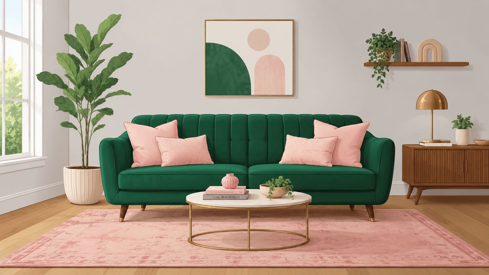
Emerald and blush appeals to homeowners who want colour with polish but don't want their interiors to feel overly formal. Emerald carries enough weight to ground a room. Blush keeps it approachable and current.
This combination works particularly well in urban interiors across the Greater Toronto, Hamilton, and Niagara markets, where clients often want a design-forward room that still feels restful by evening. An emerald sofa, blush accent pillows, pale plaster walls, and a light wood cocktail table can create that balance quickly.
How to keep it from feeling sugary
Blush needs structure. Without a darker counterweight, it can drift into a soft, overly sweet look that doesn't hold up against structured furniture. Emerald supplies that structure, but only if it appears in a meaningful amount, such as a sofa, lounge chair, drapery panel, or painted millwork.
A Century upholstered piece in emerald can look especially refined when paired with a patterned rug that carries faint rose, clay, or muted berry tones rather than obvious pink. That approach creates a complete room concept instead of a colour pairing that feels too literal.
Emerald and blush works best when the blush is dusty, muted, or mauve-leaning. Clear pink often looks younger than the architecture can support.
A few practical moves usually make this palette more refined:
- Use emerald first: Let green carry the largest upholstered element.
- Use blush second: Introduce it in textiles, art, or a smaller accent chair.
- Add natural wood: Oak, walnut, or medium stained maple helps bridge the two colours gracefully.
For homeowners trying to create a room with visual interest but no visual noise, Critelli's advice on how to create an eye-catching room aligns well with this palette. Emerald and blush isn't about novelty. It's about contrast with manners.
3. Amethyst & Charcoal The Sophisticated Jewel Tone Drama
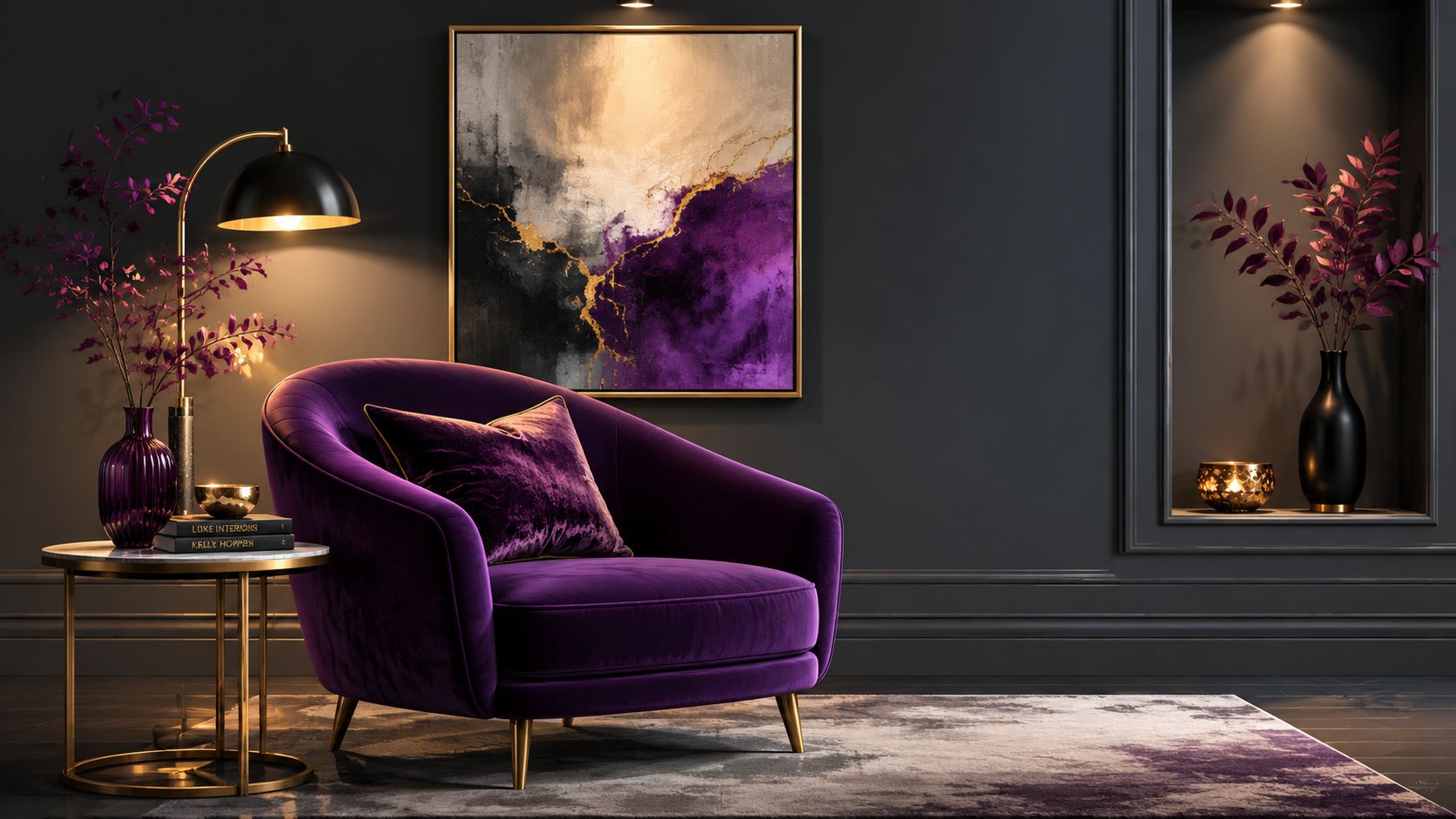
Amethyst and charcoal creates a room with gravity. It's moody, reflective, and best suited to spaces meant for reading, conversation, or retreat rather than constant activity.
This isn't a palette for every household. In bright rooms with generous daylight, it can feel enveloping and elegant. In low-light rooms with little architectural detail, it can become heavy very quickly.
Lighting decides this palette
Charcoal has to be handled carefully. Used broadly, it provides the calm backdrop that lets amethyst read as luxurious. Used without enough warmth, it can make purple feel cold and distant.
Warm lighting is essential, and so is material contrast. Velvet, wool, brushed metal, smoked glass, and natural wood all help break up the visual density. A Stressless recliner in a deep plum-toned leather or fabric can be a beautiful way to introduce the colour without committing an entire room to it.
For visual presentations, digital mood boards, or merchandising concepts, colour logic matters as well. In data visualization, jewel-tone palettes are most effective when hue shifts distinguish categories, while changes in lightness or saturation carry ordered information, because viewers read saturation and lightness as more quantitative than hue changes in this colour guidance. The same principle applies in interiors at a practical level. If amethyst, charcoal, and metallics all sit at similar visual weight, the room loses clarity.
A dramatic palette still needs hierarchy. One surface should lead, another should support, and a third should relieve the eye.
Clients exploring layered, expressive rooms often benefit from Critelli's perspective on using colour to set mood with intention. Amethyst and charcoal can be magnificent, but only when restraint shapes the drama.
4. Ruby & Cream The Warm Jewel Tone Classic
Ruby and cream belongs to rooms that are meant to welcome people in and hold them there. It has the warmth of traditional interiors, but it doesn't have to feel formal in an old-fashioned way.
A dining room is often the most natural home for this palette. Ruby on one wall, cream on the remaining walls and ceiling, warm wood furniture, and a traditional rug create an atmosphere that feels established without becoming severe. In a library or sitting room, ruby also pairs beautifully with leather, brass, and framed artwork.
The balance that keeps ruby elegant
Too much red can shorten the life of a room. It can also dominate faces, artwork, and wood finishes. Cream is what gives ruby room to breathe.
A custom upholstered chair from Hancock & Moore or Century in a ruby fabric or leather often delivers more sophistication than ruby paint on every surface. The same is true of smaller pieces. A pale side table, ivory lamp shade, or cream linen drapery gives the eye a place to rest.
- Use ruby where it matters: Upholstery, a fireplace wall, or dining chairs often carries more impact than full-room saturation.
- Soften with textiles: Cream drapery and lighter rugs keep the palette from looking theatrical.
- Respect the architecture: Ruby feels especially at home with millwork, panelled walls, and traditional furniture silhouettes.
A thoughtfully selected light-toned accent piece can sharpen this contrast, especially in heritage-leaning spaces. Critelli's look at the white side table as a balancing element shows how a lighter companion piece can steady a richer palette without making it feel stark.
Ruby and cream succeeds because it feels human. It's polished, yes, but it still knows how to be inviting.
5. Teal & Bronze The Transitional Jewel Tone Bridge
Teal and bronze sits comfortably between traditional and contemporary design. That's what makes it so useful. Clients who aren't drawn to strong purple or red often find teal easier to live with, especially when they want colour that still feels grounded.
This palette is a natural fit for transitional homes in Southern Ontario. Open-concept layouts, mixed wood finishes, and a blend of older and newer furniture all tend to welcome teal. Bronze then ties the palette back to warmth, whether through lighting, hardware, or sculptural accessories.
Why this mix feels easy to live with
Teal is forgiving because it contains both blue and green. It can lean calm, energetic, or polished depending on what surrounds it. Bronze keeps it from turning coastal or overly cool.
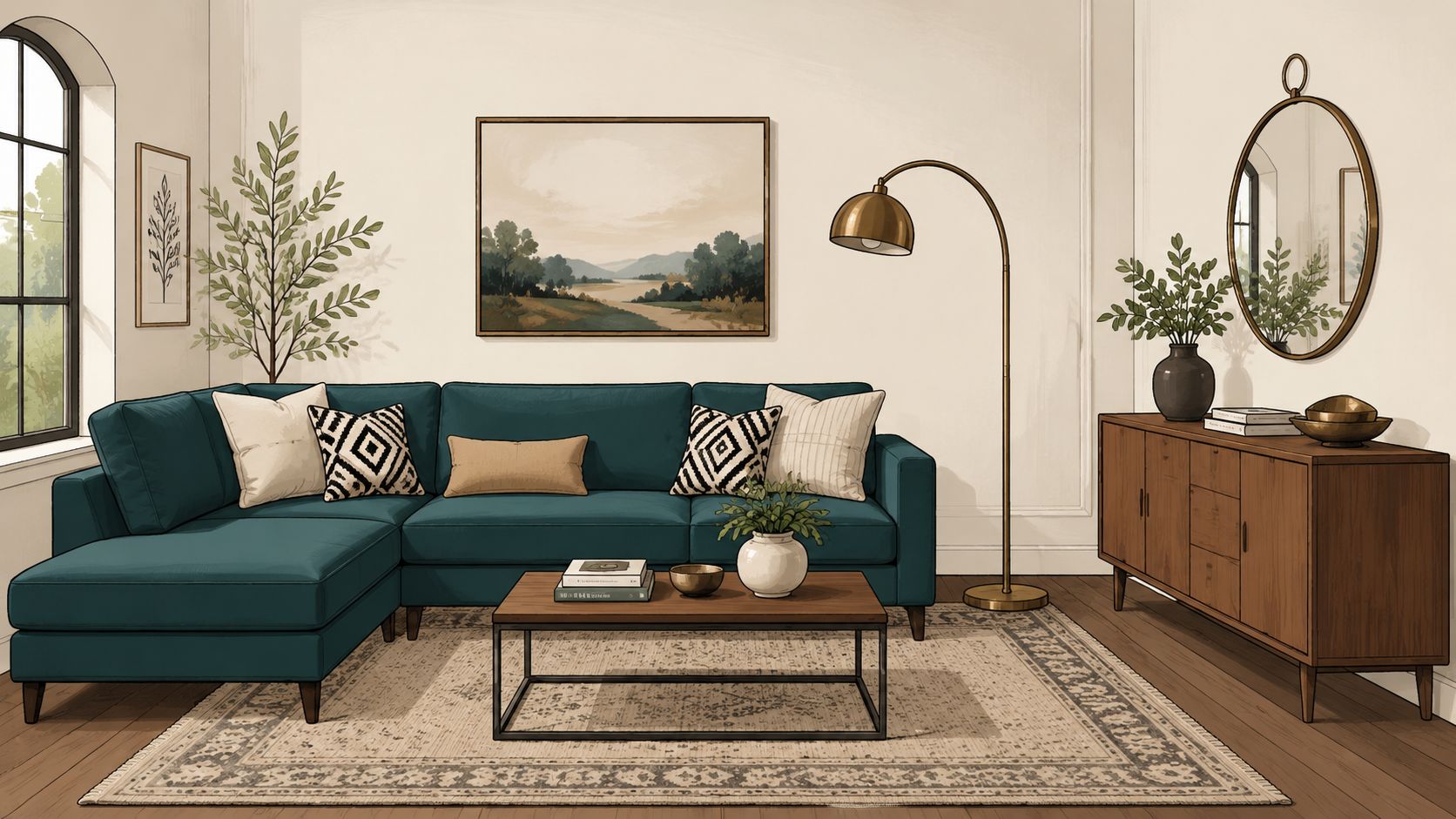
A teal sectional in a family room can pair comfortably with walnut tables, a bronze floor lamp, and a rug carrying soft camel, stone, and blue-green notes. A teal Stressless recliner in a home office can do the same work on a smaller scale, especially beside warm wood shelving.
Rooms that mix eras often need a bridge colour. Teal does that job exceptionally well.
For homeowners who want a richer interior without repainting the entire house, upholstery and rugs can do most of the heavy lifting. Critelli's approach to adding colour without painting fits this palette especially well.
A few trade-offs are worth noting:
- What works: Teal with warm greys, oatmeal, walnut, bronze, and textured wool.
- What doesn't: Teal with too many cool silvers and stark whites. That combination can feel sharp rather than layered.
- What improves it: Repetition. If teal appears once, it can look accidental. If it appears in upholstery, art, and a small rug detail, it feels intentional.
Teal and bronze isn't loud. It's composed, adaptable, and often the right answer for clients moving between styles.
6. Topaz & Mahogany The Warm Jewel Tone Richness
Topaz and mahogany is a palette for people who value craftsmanship as much as colour. It's less about contrast and more about depth built in warm layers. That makes it especially effective in formal living rooms, studies, and dining rooms where wood furniture deserves to be part of the visual story.
Mahogany already carries authority. Topaz introduces light and softness without diluting that character. Together, they create rooms that feel settled and substantial.
A better way to build warmth
Many warm palettes fail because everything sits in the same middle range. Brown wood, beige upholstery, tan walls, and gold accessories can become muddy. Topaz solves that by lifting the room with a more luminous golden note.
Upholstery selection matters. A Stickley sofa in a warm amber or topaz fabric can make surrounding wood look richer rather than heavier. Leather also works, but the finish should be supple and matte rather than glossy if the goal is timeless craftsmanship instead of formality for its own sake.
A hand-knotted rug is often the ideal bridge between these two tones. Patterns with warm gold, tobacco, ivory, and brown help unify the palette while keeping the floor active enough to support the furniture above it. In a complete room concept, that rug often becomes the quiet hero.
- Use ivory around the perimeter: Walls and drapery should lighten the envelope.
- Let wood stay visible: Don't bury mahogany under too many competing stains.
- Choose warm light: Soft lighting helps topaz read as elegant rather than bright.
Topaz and mahogany also suits executive offices and private studies because it signals permanence. It doesn't ask for attention. It holds it.
7. Peridot & Slate The Fresh Jewel Tone Modern
Peridot and slate offers a cleaner, brisker interpretation of jewel tone color palettes. It has energy, but it doesn't have the formal weight of emerald or garnet. For contemporary homes, that's often exactly the point.
Peridot works well when a client wants colour that feels optimistic and modern without drifting into novelty. Slate then grounds the room with enough seriousness to keep the green polished.
How to use green without crowding a room
This palette is particularly relevant in compact living spaces. Guidance aimed at smaller Canadian homes notes that jewel tones often work better as accent systems rather than full-room themes, especially in urban Southern Ontario where condos and compact homes are common and proportion matters in this discussion of jewel tones in smaller spaces. That insight is useful well beyond condos.
A peridot lounge chair, bench, or pair of dining chairs can wake up a room without visually compressing it. Slate can then appear in a rug border, fireplace surround, lamp base, or painted bookcase backing. Light oak or ash is an excellent companion because it warms the coolness without competing with it.
In smaller rooms, jewel tones should anchor a moment, not cover every surface.
This palette tends to suit modern family rooms, lofts, and bedrooms with simpler architecture. It also pairs well with tactile materials such as boucle, wool, stone, and woven baskets. A contemporary Stressless chair in a green tone with a slate ottoman can create a strong focal point that still feels practical and relaxed.
The biggest mistake is overcommitting to cool finishes. Too much slate, chrome, and crisp white can make peridot look acidic. The room needs some natural texture to stay welcoming.
8. Garnet & Ivory The Jewel Tone Heritage Palette
Garnet and ivory feels rooted in history, but it doesn't have to feel stuck there. This palette suits heritage homes, formal dining rooms, and period-inspired interiors because it respects architecture that already carries ornament, moulding, or older woodwork.
Garnet is darker and more restrained than a bright red. It brings dignity. Ivory then softens the contrast and prevents the room from becoming oppressive.
Where heritage palettes still feel current
The most successful garnet rooms don't saturate every surface. They place the colour where it can support architectural rhythm. A dining room with garnet walls below a picture rail and ivory above can feel refined. So can a study with ivory walls, garnet drapery, and a traditional sofa or wing chair in a deep red fabric.
There's also a useful technical principle when building with deeper jewel tones. One practical benchmark recommends pairing dark accents such as Garnet (#671f10), Sapphire (#401c74), Plum (#4c0043), and Merlot (#3d0002) with much lighter supports like Frost (#f4ffff) or Topaz (#f8dbb1) so text and design elements maintain enough contrast in this palette guidance. Interiors benefit from the same thinking. Dark colour becomes more elegant when something lighter carries the visual relief.
- Best application: Dining rooms, studies, and formal sitting rooms.
- Best companions: Brass, bronze, ivory upholstery, dark wood, and traditional rugs.
- Best restraint: Keep adjoining spaces lighter so the garnet room feels intentional, not heavy.
A garnet leather chair, an ivory sofa, and a hand-knotted rug with cream and red patterning can honour a period home while still supporting modern comfort. That balance is often what makes a heritage palette feel current.
8 Jewel-Tone Palette Comparison
| Palette | Implementation complexity | Resource requirements | Expected outcomes | Ideal use cases | Key advantages |
|---|---|---|---|---|---|
| Sapphire & Gold | Moderate, needs balanced lighting and selective coverage | Quality lighting, gold accents, rich woods, hand-knotted rugs, velvet upholstery | Timeless, regal, visually deep and warm | Formal living, libraries, master bedrooms, hotel lobbies, boardrooms | Immediately elegant, pairs with premium finishes, versatile traditional/contemporary |
| Emerald & Blush | Moderate, requires skilled colour balancing | Accent upholstery, blush textiles, bespoke pieces, controlled lighting | Fresh, modern yet sophisticated and inviting | Contemporary apartments, boutique hotels, showrooms, open-plan spaces | Design-forward, inviting, photographs well |
| Amethyst & Charcoal | High, demands lighting design and careful accessorizing | Dramatic lighting, artwork, metallic accents, premium upholstery | Moody, gallery-like, distinctive and curated | Art collector homes, luxury retreats, intimate seating rooms | Memorable, enhances premium materials, strong personality |
| Ruby & Cream | Moderate, risk of heavy or formal feel if overused | Traditional furniture, cream textiles, brass lighting, classic rugs | Warm, romantic, classic and welcoming | Dining rooms, libraries, heritage homes, formal entertaining spaces | Universally perceived luxury, complements traditional craftsmanship |
| Teal & Bronze | Low–Moderate, needs metal coordination and intent | Bronze fixtures, teal upholstery, warm wood finishes, mixed-pattern rugs | Transitional, balanced blend of contemporary and traditional | Transitional homes, open-concept living, master bedrooms, home offices | Versatile, wide appeal, bridges styles without losing richness |
| Topaz & Mahogany | Moderate–High, can feel dated without contemporary refresh | Mahogany furniture, topaz upholstery, warm lighting, heirloom accessories | Rich, opulent, grounded and established | Formal living, executive offices, traditional libraries, showcase homes | Immediate luxury perception, highlights investment-quality furniture |
| Peridot & Slate | Moderate, lighting critical to prevent washed-out greens | Ample natural light, contemporary upholstery, natural materials, light woods | Fresh, energizing, modern with calming grounding | Lofts, eco-conscious residences, modern family rooms, design-forward bedrooms | Contemporary appeal, bold yet balanced, nature-inspired |
| Garnet & Ivory | Moderate, needs contemporary balance to avoid dated formality | Period-appropriate furniture, ivory textiles (higher maintenance), traditional rugs | Heritage, refined, formal yet accessible | Historic homes, formal dining, period restorations, Victorian/Colonial residences | Heritage authenticity, excellent backdrop for art and architectural detail |
From Concept to Completion Your Bespoke Interior Awaits
These jewel tone color palettes are more than attractive pairings. They're useful starting points for building rooms with identity, proportion, and longevity. Colour alone doesn't create that result. The room has to be composed through finish, scale, lighting, textile weight, and the relationship between major pieces and supporting ones.
That's where a family-run firm with a long design history offers real value. Since 1914, Critelli has approached furnishings as part of a complete room concept rather than a series of disconnected purchases. A sapphire chair may be the spark, but the room still needs the right rug, the right table finish, the right lamp height, and the right textile balance to feel resolved.
For many homes across St. Catharines, the Greater Niagara region, Hamilton, and Toronto, the most successful jewel tone interiors begin from the floor up. A hand-knotted rug often establishes the palette more gracefully than a paint chip does, which is why The Rug Market remains such an important part of the design process. Art for your Floor isn't a slogan. It's a practical design principle. The rug carries colour, movement, and scale while giving upholstered furniture and case goods a unifying foundation.
Interior design services also matter more with jewel tones because these palettes can go wrong in predictable ways. Too many dark values and the room feels compressed. Too many shiny surfaces and the room feels staged. Too little contrast and the whole concept loses shape. Bespoke guidance helps clients avoid those missteps while choosing fabrics, woods, metals, and silhouettes that will still feel right years from now.
For clients refining sketches, samples, or presentation boards, it can also help to look at adjacent inspiration tools such as marker-friendly color schemes, then translate those broad ideas into furnishings and materials that suit the architecture of the home.
Critelli Furniture is one relevant option for homeowners looking to connect inspiration with actual products, custom possibilities, and design support in Southern Ontario. The transition from showroom to home matters as well. White-glove delivery closes the loop, ensuring that placement, setup, and final presentation match the care that went into the selections.
Ready to explore the possibilities? Let's create something timeless together.
Book your complimentary design consultation today.
Visit the Rug Market to find your room's foundation.
Experience the craftsmanship in person at our King Street Showroom.
For homeowners building a room with heirloom quality, bespoke detail, and a design-forward point of view, Critelli Furniture offers curated collections, Interior Design Studio support, The Rug Market, and white-glove service across Southern Ontario.