CRITELLI'S SUMMER SALE | UP TO 70% OFF



Choosing a Wall Unit for Living Room Style and Function

A homeowner often reaches the same point after moving into a new space: the television is in place, books and baskets are gathering on the floor, and a collection of beautiful objects has nowhere to land. The empty wall looks full of possibility, yet a wall unit for living room use can quickly become too large, too shallow, too open, or too focused on electronics.
The right piece isn't a decorative backdrop. It's a room-defining storage system, planned around the way a household reads, relaxes, entertains, works, and manages modern technology. The following guide walks through proportion, construction, storage, finishes, lighting, installation, and the design-studio decisions that turn a promising wall into a composed living space.
Imagining the Wall Unit Your Living Room Deserves
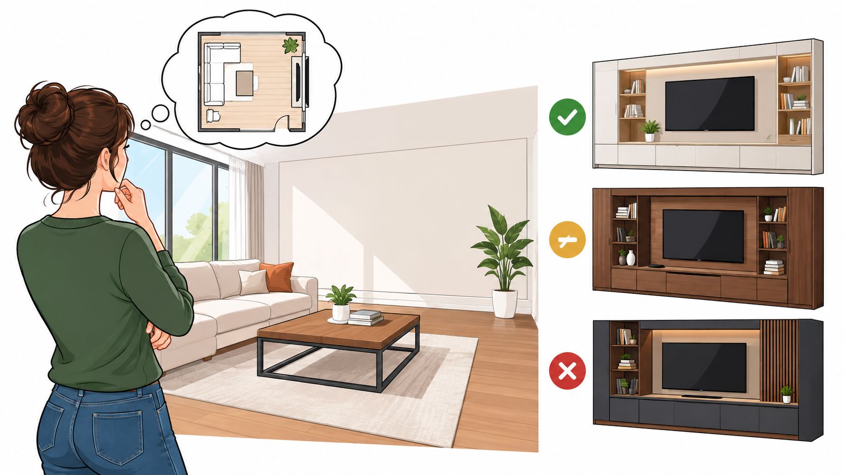
Standing in an empty living room, a homeowner may mentally place a long cabinet below the television, shelves above it, and perhaps a tall section at one side for books or ceramics. That first image is useful, but it's only the beginning. Before measurements or finish samples, the household needs to decide what the wall unit must do.
A living room with shelves full of novels has different requirements from one organised around vinyl records. A family with children may need concealed space for toys, while another household may prioritise a turntable, gaming consoles, or a carefully edited collection of artisanal objects. The design should begin with those habits, not with a photograph of a room that belongs to someone else.
Designer's Insight: The most successful wall unit behaves like architecture. It directs the eye, organises clutter, and gives the room a visual centre without asking every shelf to perform the same job.
The room's character matters just as much. A traditional interior may call for heirloom quality woodwork, framed doors, and timeless craftsmanship. A contemporary condo may benefit from a quieter composition, fewer vertical divisions, and a finish that lets the architecture remain visible. In either case, the unit should support the room rather than overpower it.
A planning mindset before a tape measure
A homeowner can begin with a simple inventory:
- Daily storage: Books, games, records, media accessories, paperwork, or children's belongings.
- Display objects: Ceramics, framed art, travel pieces, sculpture, or family photographs.
- Technology: Television, speakers, receivers, consoles, routers, chargers, and remote controls.
- Future flexibility: The objects and devices likely to remain, change, or grow.
The wall unit will also shape how the room is lit and entered. A tall cabinet can frame a doorway, open shelving can catch afternoon light, and a dark media bay can visually ground a pale room. For additional inspiration on creating a strong focal wall, the Painters North Shore feature wall guide offers useful ideas about colour, texture, and visual emphasis.
The guiding question is straightforward: what should this wall make easier? Once that answer is clear, style becomes a deliberate expression of function instead of decoration applied after the fact.
Reading Your Room Before You Choose a Wall Unit
A designer reads a room the way a theatre director reads a stage. The walls establish the set, the furniture creates the action, and circulation determines whether the performance feels graceful or cramped. A wall unit must fit that choreography, not merely occupy an available stretch of drywall.
Begin with the wall itself. Record its width and height, then note the ceiling line, baseboard depth, windows, doors, vents, radiators, switches, and electrical outlets. A unit that looks perfectly proportioned in a photograph may fail in person if a cabinet door collides with a casing or a tall section interrupts an air return.
Proportion creates calm
As a starting point, a wall unit can anchor roughly two-thirds to three-quarters of the wall's usable width. That isn't a law. It's a way to avoid two common errors, a small piece floating without purpose or a full-height installation that leaves no breathing room.
The centreline deserves equal attention. Aligning the television or central bay with a fireplace, sofa back, or another fixed feature creates order. If the room opens toward a kitchen, the unit should also look balanced from that approach, since open-concept rooms are experienced from several angles rather than from one seated position.
Traffic flow needs a physical test. Mark the proposed depth on the floor with painter's tape, then walk from the entry to the sofa, from the kitchen to the seating zone, and around any nearby coffee table. Drawers and doors need room to open, while AV equipment needs ventilation behind receivers and consoles. A deep cabinet placed beside a narrow passage can make an otherwise generous room feel obstructed.
Record the room before shopping
Photograph the empty wall straight on, then take views from the entry, sofa, and kitchen. Add a quick sketch showing:
- Wall width and ceiling height.
- Window and door locations.
- Baseboard and trim projections.
- Outlet, switch, vent, and cable positions.
- The proposed unit depth and clearance for opening fronts.
These records make a showroom conversation more productive. They also reveal sightline problems that aren't obvious when someone is standing directly in front of the wall.
Built-In Versus Modular Wall Units
The built-in versus modular decision becomes clearer when treated as a choice between architectural permanence and adaptable furniture. Neither format is automatically superior. The suitable option depends on the home's geometry, renovation timeline, ownership plans, and appetite for change.
A built-in is permanently integrated with the wall, floor, or ceiling. It can follow an irregular wall length, accommodate a sloped ceiling, conceal awkward corners, and appear to belong to the architecture from the beginning. That effect demands more planning. Professional design, on-site templating, detailed drawings, and installation are usually part of the process.
A modular system uses separate cabinets, sideboards, bridge shelves, or towers. It can be reconfigured, moved, expanded, or divided between rooms. Standard proportions make the purchase and installation more straightforward, although visible seams and fixed component dimensions may limit how closely the system follows an unusual wall.
The decision at a glance
| Criterion | Built-In | Modular |
|---|---|---|
| Permanence | Fixed to the room and difficult to relocate | Can be moved or rearranged |
| Customisation | High, including fillers, ceiling lines, and cable routes | Guided by available component sizes |
| Budget planning | Includes design, templating, fabrication, and installation | Often simpler to price by component |
| Lead time | Usually requires a longer coordinated process | May offer a faster path when components are available |
| Installation | More involved, with precise fitting and anchoring | Generally less complex, though tall pieces still require restraint |
| Resale effect | Can signal craftsmanship when well matched to the home | Gives future owners more flexibility |
| Best fit | Irregular architecture and long-term ownership | Evolving households, rentals, or changing layouts |
A built-in can influence resale in both directions. Timeless craftsmanship may strengthen the sense that a home has been carefully finished, while a highly personal or dated installation may narrow a future buyer's options. A modular arrangement carries less architectural risk, but it may never achieve the uninterrupted appearance of bespoke millwork.
For homeowners exploring a fitted composition, Critelli's wall-to-wall shelving units provide a useful reference point for understanding how shelving, cabinetry, and wall anchoring can work together.
Match the format to the timeline
A household expecting to move, renovate again, or change rooms may favour modularity. A homeowner shaping a permanent living room around a fireplace, unusual ceiling, or carefully planned media wall may find the built-in route more satisfying.
The most important comparison isn't cost. It's the relationship between customisation depth, installation complexity, permanence, and future flexibility. A well-made modular wall unit can feel intentional when the components are aligned carefully. A built-in only feels successful when its proportions and details respect the room.
Balancing Storage, Display, and AV Integration
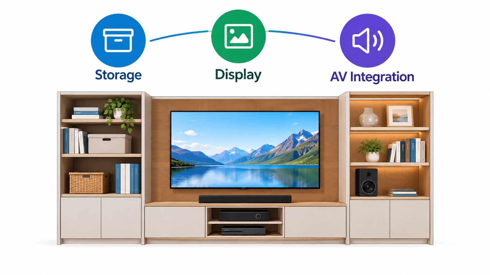
A wall unit rarely performs one task. Enclosed storage hides visual noise, open shelving gives treasured objects room to breathe, and the media bay must accommodate equipment without turning the centre of the room into a tangle of cables. Treating those needs as separate purchases often produces a crowded composition.
A more reliable method divides the unit into vertical columns. One column may hold closed cabinets for games and accessories, another may frame the television, and a third may display books or ceramics. Each column gets a primary role, while smaller shelves and drawers provide secondary functions.
Give every compartment a job
The 70/30 rule works as a starting framework, with roughly seventy percent closed storage and thirty percent open display. The figures are not a decorating law, but the principle is valuable: most modern living rooms contain more visual clutter than they want to show.
Closed storage can conceal:
- Remotes, controllers, and charging cables.
- Board games, toys, and paperwork.
- Routers, power bars, and spare devices.
- Media collections that aren't used every day.
Open areas should be more selective. Books, framed photographs, ceramics, and objects with personal meaning deserve visibility. If every shelf is filled, the eye can't identify what matters.
The central media bay should be designed around the television's actual dimensions, not around a guessed future model. Receivers and consoles need air circulation, while doors surrounding equipment may require acoustic fabric or ventilation slots. A single concealed cable channel is preferable to multiple improvised openings because it keeps power and signal wiring organised as technology changes.
Think beyond the television
Open-concept floor plans and denser urban living have increased the pressure on living-room storage. A useful wall unit should manage the everyday technology that creates clutter, not provide an attractive frame around the screen.
A homeowner comparing proportions can also benefit from practical guidance on sizing rattan entertainment units, particularly when considering how material, depth, and ventilation influence the media zone.
For a more integrated approach, design TV units can be evaluated as part of the full wall composition rather than selected as an isolated console. The strongest design lets storage, display, and AV equipment reinforce one another. The screen remains accessible, but it isn't the only object the room acknowledges.
Finishes Hardware and Lighting That Tie the Room Together
Finishes and hardware give a wall unit its vocabulary. The wood tone, metal detail, glass surface, and interior lighting should sound as though they belong to the same sentence, not as though they were collected from unrelated rooms.
Start with the floor. A wood finish can echo its undertone, or contrast deliberately. Warm walnut against pale oak can look purposeful, while two similar medium-brown stains may create a muddy result. The choice should account for natural light, adjacent upholstery, and the visual weight of the television.
A repeated metal accent establishes rhythm. Door pulls, lamp stems, picture frames, or a nearby table can carry the same finish across the room. Repetition matters more than quantity. One consistent metal detail used in several quiet places often looks more refined than a mixture of competing hardware.
Finish combinations with a clear point of view
| Wood Tone | Metal Accent | Complementary Surface | Best Room Mood |
|---|---|---|---|
| Warm walnut | Aged brass | Soft neutral glass | Heritage-focused and collected |
| Pale oak | Brushed nickel | Light stone or matte lacquer | Airy and contemporary |
| Deep espresso | Blackened metal | Acoustic fabric panels | Quiet and architectural |
| Medium natural wood | Warm bronze | Textured ceramic or woven panels | Artisanal and relaxed |
Back-painted glass can anchor a media bay, soften the appearance of a dark screen, and reflect nearby lamp light when the television is off. Inside open niches, integrated LED strips beneath shelves make display pieces visible after dark without exposing a fixture.
Soft-close hinges and drawers make daily use quieter. Matte finishes are forgiving in family rooms, while acoustic fabric inserts on doors beside the media centre can soften reflected sound. Each detail should serve either the hand, the eye, or the ear.
Electrical planning deserves the same care. A qualified professional can help coordinate the room's lighting and power requirements, and an outdoor lighting electrician may offer useful perspective when indoor and exterior lighting systems need to work together.
For a more layered evening atmosphere, Critelli's guide to mood lighting for a living room can help homeowners consider how illumination changes the wall unit after sunset.
Why the Best Wall Unit Is Often the Smaller Smarter One
Large furniture can create the impression of value, but scale isn't measured by cabinet volume alone. In a Southern Ontario condo, townhome, or open-concept main floor, an oversized wall unit can block kitchen sightlines, compress circulation, and make statement seating feel crowded.
Ontario's storage situation reflects the pressure households feel to organise possessions efficiently. The province has 37.3 million square feet of self-storage, an increase of 9% in three years, while newer condo units have often shifted from roughly 1,200 to 1,400 square feet in older builds to about 650 to 850 square feet in newer ones, as reported in this Ontario storage and condo-size guide. Those figures support a practical design conclusion: storage needs remain substantial even as available living space contracts.
Smarter means more precise
A compact wall unit can work harder when its interiors are designed around real objects:
- Charging drawers: Grommets keep cables inside while devices recharge.
- Ventilated media cabinets: Consoles and receivers receive the air circulation they need.
- Vertical dividers: Trays, laptops, records, and portfolios stay upright rather than collapsing into piles.
- Adjustable shelving: Changing collections don't force a new cabinet layout.
- One cable route: Power and signal cords travel through a concealed channel instead of spreading behind the unit.
The media bay should fit the television and equipment without leaving a cavern of unused space. Closed doors can hide routers and accessories, while a small open section may hold the objects that give the room its identity.
Practical rule: Negative space is part of the design. A wall unit doesn't need to fill every available inch to feel substantial.
A smaller, well-finished piece often looks more expensive than a sprawling installation that fights the architecture. Restraint also leaves room for a hand-knotted rug, a sculptural lamp, or a generous sofa to carry visual weight. In a complete room concept, the cabinetry is one instrument in the arrangement, not the entire orchestra.
From Showroom to White-Glove Delivery
A wall unit with heirloom quality is the result of many coordinated decisions. The process begins with physical material samples, where a homeowner can compare wood grain, matte lacquer, metal trims, glass, and fabric under proper showroom lighting rather than relying on a screen.
The design studio then translates the room into a workable drawing. Measurements show whether a credenza clears the baseboard, whether a tall cabinet meets the ceiling line, and whether the media bay can connect to existing outlets. Three-dimensional views can clarify the relationship between the unit, sofa, rug, windows, and nearby circulation before fabrication begins.
Precision happens before delivery
Shop drawings turn a concept into a buildable object. They identify joints, hinges, shelf positions, door swings, cable cut-outs, fillers, and clearances. That stage gives the homeowner an opportunity to catch a misplaced outlet or an inconvenient shelf before the workshop starts.
Custom finishing adds another layer of care. Hand-rubbed stains, sealed lacquers, carefully aligned veneers, and protected glass doors all contribute to the final impression. Packaging also matters, particularly for tall cabinets, AV panels, and other components that can be damaged by careless handling.

Ontario white-glove delivery commonly means more than leaving boxes at the front door. The service category can include room-of-choice delivery, full assembly, packaging removal, and in-home placement, as described by an Ontario furniture retailer's white-glove delivery explanation.
On delivery day, installers should protect the entry path, bring components into the room, level each section, and secure tall pieces correctly. Health Canada advises anchoring tall furniture with anti-tip devices, using either a wall stud or heavy-duty drywall anchors designed for the specific furniture and substrate, as explained in its furniture and television tip-over safety guidance.
For a wall unit, stud-backed anchoring is the most reliable option when available. IKEA Canada's wall anchoring guide distinguishes hardware by wall type, including screws for wood studs, plug-and-screw combinations for suitable solid or studless walls, and toggle-style anchors for hollow walls. Installation should finish with AV connections, a level check, and debris removal, leaving the living room ready for use.
The white-glove delivery service represents the final link between design intent and the room itself. A considered process protects the craftsmanship at every stage.
Begin With a Complimentary Design Consultation
A productive consultation starts with ordinary evidence from the home. A homeowner can bring a floor plan, phone photographs of the empty wall, and a short wish list describing what the living room needs to store, conceal, and display.
The designer then studies the wall as a complete environment. Window heights, ceiling lines, flooring transitions, baseboards, outlets, vents, and entry paths all affect the drawing. Three layout directions might place the television centrally, shift it to accommodate a fireplace, or use a lower console with taller storage at one side.
From sketches to a room concept
Finish samples and hardware pulls make the discussion tangible. A homeowner can compare the warmth of walnut with pale oak, test the feel of a door pull, and see whether a media bay needs glass, fabric, or a quieter solid front. The concept becomes more than an image. It becomes a plan tied to the actual room.
Ontario interior design services often begin with a consultation and space-planning deliverable. One Ontario designer describes a two-hour consultation that reviews colour, style, function, and flow while sketching a floor plan, as outlined in this Ontario interior design consultation example. Critelli's complimentary interior design consultation gives homeowners a similar opportunity to clarify proportion and function before committing to a direction.
A wall unit also benefits from a complete room concept. Critelli's two St. Catharines locations, on King Street and St. Paul Street, support a multi-showroom approach to furniture, lighting, and rugs. Its Rug Market presents hand-knotted rugs made by Nepalese weavers using wool from Himalayan Highland sheep, a concrete artisanal foundation for the positioning of rugs as “Art for your Floor”. A carefully chosen rug can establish the room's palette before the wall unit's finish is finalised.
Critelli Furniture was founded in 1914 and remains family-run, connecting the design-studio process with a century-old understanding of living well. For homeowners across the Greater Niagara, Hamilton, and Toronto markets, the invitation is practical: bring the room in the head, the measurements in hand, and leave with a wall unit planned for the space.
Experience the craftsmanship in person at the King Street Showroom, or book a complimentary design consultation to explore a wall unit, complete room concept, and hand-knotted rug foundation. Visit Critelli Furniture to begin planning a design-forward living room with bespoke details and white-glove care.